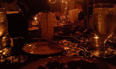
Dining in the Dark

Two weeks ago our longtime client Olmsted Center for Sight (formerly the lengthily-named Elizabeth Pierce Olmsted, M.D. Center for the Visually Impaired) held a benefit dinner titled “Dining in the Dark.” The concept was quite simple and given away by its name — attendees would enjoy a meal in total darkness. Not only did my company co-sponsor the event, I attended it and had the pleasure of dining with Olmsted’s president.
The meal started off with wine and salad, which you were allowed to eat in light. Then we were presented with bibs and blindfolds, and the lighting was turned down to just the candles on the table (the servers needed to see, after all). And so in darkness we set upon the main course followed by the dessert course and wrapped up with coffee service. During the main course an Olmsted representative guided us through techniques to get the lay of the land, identify foods, cut meat, find drinks and so on. I ignored all this and dove in with my characteristic nonchalance about my meal and found myself stymied by the simplest things — it takes a couple tries to realize your knife is upside down and that you are cutting with the blunt edge and not the sharp edge.
I have spent over a decade working with Olmsted Center for Sight. I have had the opportunity to see how its clientele/constituency uses computers and surfs the web. I have attended seminars, spoken at events, been a part of lawmaking discussions, implemented software and web sites, all in my time consulting with Olmsted. I have been working with low-vision and blind users for most of my professional career, but nearly always in the form of technology. Though I had some time running concerts for thousands of attendees and making sure outdoor and non-standard venues were handicapped accessible, this dinner afforded the chance for me to experience some of the day-to-day tasks that I take for granted, but this time without sight.
This post may seem to be a little outside of my generally technical discussions here, but I believe that experiences like this are important for anybody who cares about inclusive design or accessibility. Some day everyone reading this will have reduced vision, mobility, hearing, and so on. Learning now how to design and build to support those changes serves to position future generations of developers to design and build to support the future you. That’s just a good investment in your long term well-being.
Consider spending an hour blindfolded and try to do a mundane task like get dressed, eat a meal, or even use the web to look up a menu on a web site (you’ve already seen me rant about how awful that experience is for average users). Consider limiting your movement, restricting yourself to a chair, putting in earplugs, and so on. You may find your get far more insight into daily life as well as software and web development than you expected.
If you’re still reading and also care about accessibility, then in keeping with the low vision theme of this post here are some resources to use when developing sites for the blind. This is not an exhaustive list by any means, but there are links to many others within.
- Screen reader demos, research and resources by Alistair Duggin. Written the day after my dinner.
- Web Accessibility Toolbar 2012 from The Paciello Group. A handy resource to validate and review any page you are viewing.
- The NonVisual Desktop Access (NVDA) screen reader (MS WIndows) is a free resource (for which you should donate) that can help you understand how a site is “heard” by a blind user.
This handy video shows you how blind people use the iPhone 4S. It’s worth a couple minutes of your time.
This link isn’t a resource, instead it’s a story of a police department using its forensic techniques to help save 26 pages of hand-written content after the blind writer’s pen ran out of ink.
Leave a Comment or Response