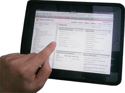
More on Hover vs. Touch

If you are an avid reader of my blog (and you are, aren’t you?) then you might recall when I wrote the article UX Challenges in Touch Interfaces over at evolt.org. I discussed how users have become accustomed to using mice and developers have become accustomed to designing for the mouse. Ultimately this results and smaller and smaller clickable elements and hidden features or messages that only reveal themselves when the mouse cursor wanders their way.
Less than a week after my article went up, another article with a tighter focus on the hover state of the web appeared: Non Hover. The article references the (impossible to use in a desktop browser) reference from Apple, Preparing Your Web Content for iPad as the official statement from Apple that mouse-related script or styles won’t work on its devices.
The article continues to discuss potential issues with relying on the mouse, and offers some general strategies to cope with its absence as you as a developer continue to build web sites and/or web applications. In particular, the article gives us a list of things to avoid:
- Hyperlinks that aren’t 100% obvious
- Javascript tooltips that show important information or metadata
- Displaying action items on hover. Examples I’ve seen typically involve edit / delete items.
- Displaying graphics in a less-than-ideal state until hovered: all those semi-opaque or black & white screenshots and photos that only display full color when covered by a cursor
- Drop-down menus. While some of these can be revealed on click or tap, be sure the user has cues that show those options.
- Focusing too much on hover dependent CSS3. I know it’s a bit of a heartbreaker, but while these have always been seen as enhancements, we’re going to have to settle with the fact that multi-touch users won’t be seeing our fancy transitions.
Add these tips with the items I outline in my article, and you should be well on your way to building for the world of touch screens without losing your mind.
Leave a Comment or Response