10 (Obvious) Usability Crimes
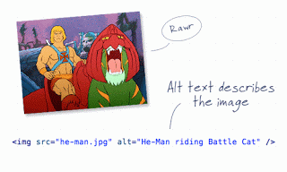
Having stumbled across the article “10 Usability Crimes You Really Shouldn’t Commit, I can see that the suggestions are pretty obvious, and the number 10 is probably more arbitrary than based on some natural break in severity. However, there are some things in the article I have been repeating for years that people just don’t get. And this article uses He-Man graphics, which makes it even cooler.
I’ll list the 10 items, but they are much cooler in context and with the He-Man photos, so go there anyway.

- Form labels that aren’t associated to form input fields;
- A logo that doesn’t link to the homepage;
- Not specifying a visited link state;
- Not indicating an active form field;
- An image without an alt description;
- A background image without a background color;
- Using long boring passages of content;
- Underlining stuff that isn’t a link;
- Telling people to click here;
- Using justified text.
4 Comments
Great list. However, I don't think #10 is a "usability crime". (I just thin the author wanted 10 items and threw that in for a round number.)
I can see how abusing the use of justified text is a problem, but labeling all justified text "unusable" is just plain silly.
For example, the "Tag cloud" on this very page is justified and that layout actually makes it easier to read, not harder.
Justified text, as rendered by a browser, can be difficult to read. The tag cloud isn't prose, it's just a collection of words at different sizes each. It's not quite a correlation.
I do agree that it's a bit of a stretch, which might be why it came in at #10.
I justify my text just to piss Adrian off.
I respect your logic.
Leave a Comment or Response