The Wrong Way to Use CSS in Page Layouts
Lately I’ve come across an ever-increasing amount of web sites that use absolute positioning with Cascading Style Sheets (CSS) to achieve some very specific layouts.
While this has been going on essentially since Macromedia Dreamweaver was released, allowing anybody comfortable with a WYSIWYG web layout package to build CSS-laden sites, recent pushes for accessibility and standards compliance in HTML has made CSS the new buzzword of the wanna-be-elite developer.
Unfortunately, many people are still using WYSIWYG packages to do their web development, and many of them are trying a table-free approach in their attempts to ride the wave of the CSS flood. What some of these developers tend to forget is that pixel-precise layouts are anything but, especially when you consider all the custom settings users may have on their systems.
For those who have read my article on liquid web design (“Liquid Design for the Web,” DisplaySearch Monitor, August 30, 2001; also available here on evolt.org), you may be familiar with my simple mantra of building for the user and allowing the layout and design of the web page to adapt to nearly any conditions that users may throw your way. Lately, however, frustrated laptop users have been directed my way (partly due to my article) because sites they visit, or worse, sites for which they’ve paid, don’t display properly on their systems.
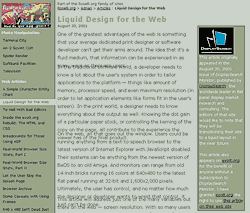
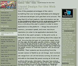
At first, the symptoms were confusing. Blocks of text supposedly sat on top of other blocks of text, copy was unreadable as words stacked themselves atop one another, and sometimes text seemed to appear out of order. It took a little while to coax a screen capture out of anyone, but eventually I got one. A sample of what I saw is included in Figures 1 and 2. Please note that I’ve butchered a page on my own site as an example, since I think the affected parties would rather not have their sites shown.
 Figure 1: This screen capture shows just a minor overlap, but enough that some of the text is unreadable.
 Figure 2: This screen capture shows a more severe example of the reported issues. Text is more illegible, and it seems impossible to determine what text goes where.
So how did this happen?
In each of these cases, a developer using a WYSIWYG editor was the culprit. Having spent many of my years as a web developer cleaning code spit out by these editors, I’ve gotten used to recognizing much of the specific syntax and style that they use. I recognized most of these offenders as Macromedia Dreamweaver. Generally regarded as one of the better editors on the market, and deservedly so, it offers the ability for developers to create table-free layouts thanks to CSS positioning syntax. Developers who wanted to claim they were ditching tabled layouts for CSS-only layouts, something that organizations such as the Web Standards Project (WaSP) have been pushing for some time, could now do just that without having to learn a lick of CSS.
Unfortunately, Dreamweaver’s approach to layouts powered by CSS is anything but ideal. It eschews structural and semantic HTML elements in favor of the most basic elements, the ones that imply nothing but act simply as containers — <div>s. Instead of wrapping headlines in headline tags (<h1> through <h6>) or blocks of text in paragraph tags (<p>), everything gets wrapped in a <div>, every paragraph, every headline, even every table. This can be overridden, and there are many talented developers who do just that, but they aren’t the ones creating these problem pages.
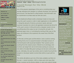
Once a developer starts dragging paragraphs around the screen, each one is assigned an absolute x and y coordinate that it must occupy, as opposed to simply flowing one after another as in a word processor. And developers did just that, they dragged every block of text to just where they wanted it. With the WYSIWYG interface hiding the underlying code, these developers never saw the coordinate being assigned to each <div>, let alone the fact that each <div> was also assigned an absolute height and width, regardless of how much content it held. Figure 3 shows what the developer would have seen, a simple layout with paragraphs of copy flowing one after another.
It’s worth noting that I have a bit of a bias against WYSIWYG editors, something you can read more about in the article “To Hell With Bad Editors“.
 Figure 3: The developer sees nothing wrong. After all, he or she is developing on his or her own system, so it should look ideal there.
What made it break?
One problem with laying out blocks of text in very specific positions on the screen is that it doesn’t take into account users who have their font sizes enlarged for any reason. It also doesn’t take into account users on flat panel displays who often have the display set to something other than 72 or 96 pixels-per-inch (ppi). And it seemed there were enough of both of these kinds of users that the calls came in.
Blocks of text ended up being larger than accounted for by the designers for these users. So while the second paragraph may have been placed 175 pixels from the top of the page, at higher resolutions or larger font sizes, the end of the paragraph above it extended below that 175 pixel mark, causing the text to overlap. Of course, this was compounded as the page progressed, and sometimes a third paragraph would start before the first one had ended.
All three of the above images are screen captures from Netscape 6.02 on Windows 2000. The default size for text in Netscape 6 is 16 pixels at 96ppi. Figure 3 shows the default setting the developer would have used. Figure 1 shows how that same page looks if the default font size is set to 18 pixels, and Figure 2 shows it set to 20 pixels. If the user had extremely good eyesight and set the font sizes to 12 pixels (lower than the developer’s settings), there would be very large gaps between the blocks of text.
Those users on laptops, for example, would see similar results if their display settings, not their browser settings, were modified. During more testing, general users of flat panel displays experienced these problems as well, owing to their tendency to run their displays at resolutions higher than 72 ppi — often 100 ppi, and even a few at 140 ppi for the group used for testing. These users were initially told by developers that the users simply had their font sizes set too large. This is regardless of the fact that if the developers were correct, users did that so they could actually read the text. And so users correctly responded that, for the most part, their font settings were at the default.
It occurred to some of the developers that people might come to the sites with larger fonts, but it was generally decided that these users could simply make their text smaller to see the page. Some of those developers, however, built their pages with type size units (pixels or points, for example) that could not be resized by the browser. It never occurred to any of the developers, however, that some users might be running at different pixel densities. So when developers had ordered their clients and their users to simply resize their fonts, and it didn’t work, they were stumped. They hadn’t gotten under the hood to see what was wrong with the code.
How did you fix this?
Correcting this problem was embarrassingly simple. By opening the pages in a plain text editor, I could immediately see the offending code. It was just a matter of replacing every positioned <div> with a more semantically correct <p> tag for paragraphs, and <h1>—<h6> tags for headings. With the removal of all positioning, the page would flow well for any user, regardless of their browser, screen settings, or font size settings. Clearly there could be exceptions, but none were encountered.
The solution was simply a case of under-engineering. Removing all the widgets resulted in an eminently usable page.
How can I tell if my site is broken?
Well, one of the simpler ways is to change your font sizes in your favorite browser. A slightly more complex method involves changing your display settings to something significantly higher than 96 ppi.
The simplest way, however, is to look at the code. It’s one thing to absolutely position some elements on the page, such as logos, navigation, or other design elements, but it’s another thing to do that with every paragraph of copy. If, in the source code, every paragraph is wrapped in a tag like the one below, you may want to run the other tests I mention above:
<div style="position:absolute;left:20px; top:175px; width:500px; height:50px; z-index:2">
The statement "position:absolute" is the first sign of trouble. The assignment of pixel values to "left" and "top" means the block is positioned a specific distance from the top left corner of the window. While a "width" attribute might not be bad, a "height" attribute could be an issue as well if the code is also set to hide text that doesn’t fit within the specified dimensions (via a "clipping" attribute).
Compounded errors
Not directly related to this, but somewhat ironic given the attempts by these designers to make more accessible pages by using CSS, was how the pages read to screen readers. Many of the developers had entered text a paragraph at a time, and not in order. When the page itself was seen by screen readers, the paragraphs were all out of order in the code, making for a very confusing page. But the developers couldn’t see this problem because every block of copy was placed on the page visually, without regard for the code beneath. This distance from the code ended up creating far more problems than intended.
Conclusion?
Clearly this article addresses some very specific cases that don’t pop up too often, but they’ve popped up enough, and with increasing frequency, that it’s worth watching out for them as a developer, user, or a buyer of web development. Web pages are anything but static, let the user push them around and you’ll be ahead of the game.
Leave a Comment or Response