Liquid Design for the Web
One of the greatest advantages of the web is something that your average dedicated print designer or software developer can’t get their arms around. The idea that it’s a fluid medium, that information can be experienced in as many ways as there are users.
In the traditional software world, a developer needs to know a lot about the user’s system in order to tailor applications to the platform — things like amount of memory, processor speed, and even maximum resolution (in order to let application elements like forms fit in the user’s screen). In the print world, a designer needs to know everything about the output as well. Knowing the dot gain of a particular paper stock, or controlling the kerning of the copy on the page, all contribute to the experience the viewer has of the final product.
On the web, all that goes out the window. Users could be running anything from a text-to-speech browser to the latest version of Internet Explorer with JavaScript disabled. Their systems can be anything from the newest version of BeOS to an old Amiga. And monitors can range from old 14-inch bricks running 16 colors at 640×480 to the latest flat panel running at 32-bit and 1,600×2,000 pixels. Ultimately, the user has control, and no matter how much the designer or developer wants to wrest that control, it just can’t be done.
This article will address just one of the many variables out there on the web — screen resolution. With so many users who leave their screen resolution at the factory default, to users who cannot change resolutions due to hardware limitations, to users who run at the highest resolution possible, there are a number of variations out there. Couple that with the fact that not everyone surfs full-screen, and most users have toolbars of some sort taking up space that could otherwise be used for web page display, and you’ve got an infinite number of possible dimensions in browser windows.
Why Liquid?
In another article some time ago I proposed the idea that designing for discrete screen resolutions was flawed in principle. Even if half of your audience has screen resolutions of 800×600, how many of them are surfing full screen without any browser chrome? Probably none. In that article, Real-World Browser Size Stats, Part II, I used my own site to track screen resolutions, window sizes, and bit-depth. The results were as expected — few of my users surf full-screen, and even fewer have their browser windows open to the specific dimensions many web sites target.
So instead of leaving users at low resolutions with a scroll bar at the bottom of their screen (requiring them to constantly scroll left-to-right-to-left to read content or see ads), or leaving users at high resolutions with large amounts of white space outside of your content, consider building pages that scale to fit the user. There are many advantages to this “liquid” design approach.
In another older article I addressed the benefits of designing for 640×480 screens (640×480 Isn’t Dead Just Yet). The main benefits from that article still apply here. By allowing a page to scale up to any resolution, as well as down to nearly any resolution, you can ensure the user determines some very important aspects of the page: the readability of the content (characters per line), the ability to print pages regardless of the user’s window size, the bandwidth constraints (since images are often tiled, re-used, or skipped in favor of colored table cells), and compatibility (if you design it correctly, you could even accommodate users on palm-top browsers).
There are some users who won’t like this solution, however. Sometimes the user chooses to surf with a maximized window, and won’t scale the window to a size that makes the text easier to read. While it may seem counter-intuitive, the user relies on fixed-width sites to control text readability instead of just scaling the window. They are, however, users, and must be kept in mind. Generally, those users are so few it is not an issue on your average site.
I’m going to describe some approaches to creating a liquid design that could be very handy. I’ll be discussing it with the use of tables for layout (for a good primer on liquid tables, visit Liquid Tables). I only qualify this because some developer-oriented sites (like A List Apart) are experimenting with CSS-driven layouts in lieu of tables. While this is definitely a stronger approach for the long-term, the few browsers that correctly support the code necessary to do this are often not enough of a general site’s audience to warrant this approach — especially if one of the goals of the site is a consistent experience for all users.
Things to Consider
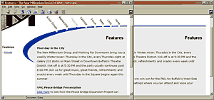
One of the first decisions you’ll need to make, even before creating a design, is what is the minimum resolution you are prepared to support. Will 640×480 be your minimum target? Do you expect WebTV traffic? If so, then perhaps 540 pixels in width is best. What about palm-top users? Do you see Pocket IE or Windows CE (as an example) in your logs often? Some of this can be answered just by polling some of your users, or even better, if you have some sort of tracking in place (the article Real-World Browser Size Stats, Part I offers a tutorial to do just this). Figure 1 shows a popular web developer site in both WebTV and Internet Explorer at an average resolution, both of which represent how some users see the site.
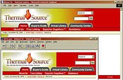
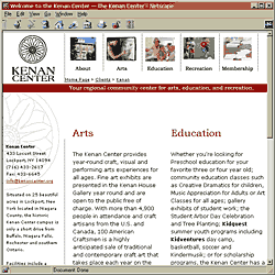
The next thing you’ll need to decide is how far back in the Navigator and Internet Explorer version history you will support, as well as what other browsers you plan to support. If you can get away with supporting Navigator 4.x and higher, you’ll have more options available to you via CSS. If you have to support versions of Navigator in the 3.0 and below range, you’ll find that you may want to skip some CSS in order to provide a more consistent experience for all your users. Figure 2 shows how the same page could appear in the latest browser as compared to an older browser.
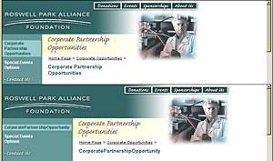
These guidelines for developing liquid tables can prove very useful for building sites where you may not have control over all the elements on the page, ensuring that the integrity of the design will remain regardless of what the user or author does to the page. For instance, if you are building a site which will be driven from a content management system, quite often text-based navigation elements or content in a particular area of the page can become much longer than anticipated when the editors of the site start inserting content or new categories. If you build a navigation bar down the left side of the page that can’t handle a very long word, it will push the width of the container out, possibly affecting your design. This can also happen if a user is surfing with larger fonts set within the browser. Building a design to be liquid, even if you do choose to hardcode a width in pixels for the overall table, can handle any exceptions that would otherwise break the layout of the page. Figure 3 shows a design that can accommodate text of any length in the navigation bar.
Finally, consider how the page will look without images. This may be something you think about anyway, since many users will see a page without images until all the files get downloaded by the browser, but liquid design can affect the way you would assign details like background colors. You may reconsider setting your expansion cell to a bright red background if it normally holds a gradient to white. It may prove less jarring to use white when it fills 90% of the width of the screen. Or you may want to set it to match another element. This generally only affects users who have disabled image loading, or are surfing on slow or spotty connections.
Basic Design Guidelines
There are some issues with building liquid pages you’ll need to keep in mind when designing your pages. Ideally, a good template has some flat color or simple tiling somewhere within it to allow its width to expand without it looking like an afterthought. When working up a design, keep in mind what sections you’ll want to expand, and make sure that you can build a table structure to accommodate it that won’t get too complex.
It is also a good idea to set some parts of the design apart almost as if there were a horizontal line dividing sections. The advantage is that you can split a header, footer, and content cell into three different tables, reducing overall complexity and allowing the browser to render the page one table at a time, instead of having to wait for all the content to be downloaded before anything may be rendered. It also allows you to make only parts of the page liquid. For instance, you may want the footer to stay centered at a particular size no matter what happens with the rest of the design. This can be achieved even within the liquid table, but it doesn’t need to be in there adding complexity to the overall code. See figure 4 for an example.
The design should not rely on the proximity of elements to one another. For instance, if the logo is in the upper-left, it can get very far from a search box in the upper right. Allowing a drop-shadow from the form button (if you use an image) or the label for the field to sit in the same image as the logo can look pretty silly at anything other than the lowest resolution. See figure 5 for an example of elements that scale appropriately.
Navigation elements, however, should have consistency from page to page, and they should also easily fit within the smallest possible size the design will accommodate. The developer should make a conscious decision on where those elements will sit as the page expands. Whether they space out, float to the left, or float to the right, the placement should be consistent from page to page for each user. If the primary navigation (such as a button bar across the top of the page) moves back and forth page after page, the user can have a hard time locating a specific button as he or she travels throughout the site. But if the button always appears in exactly the same place from page to page, it will speed access to that button for the user throughout the site. Figure 5 also shows an example of this in practice.
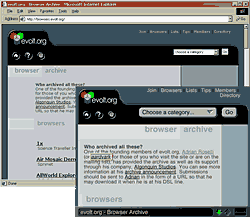
Any background images that you plan to tile should make sense at the smallest and largest possible page sizes. If the tiling image is a pair of faces that gets cut off at 640 pixels, then some users will never see them. If the pair of faces tiles every 50 pixels, users at higher resolutions can see a repeating pattern that can be very busy and distracting. Generally, the less obtrusive the part of the page that expands, the better. Figure 6 shows two sample sites that have background textures that expand across the width of the screen.

When working up a design, consider what elements you can re-use. Is there a tile that could be re-used elsewhere in the pagejust by removing a drop-shadow? Is there a logo that could be re-used if the type-treatment were a separate image? The more you can re-use images, the lower the overall weight of the page will be, making for a faster download and rendering speed. Using areas of flat color is also a good idea, allowing you to use HTML to color areas of the layout instead of using possibly large images to tile.
Some Caveats
Unfortunately, there is no way in HTML to set a maximum width on an element. You can tell a table to go to a specific width in pixels, or in percent, but you can’t tell it to expand to fit the window up to 1,000 pixels, for example. This may affect how you decide to code some pages, and may even affect your decision to build a liquid design.
Netscape Navigator, through version 4.x, has a bug with rendering background images, whether called in the HTML or called by CSS. If you call a background image in a table tag, Navigator will not render the image behind the entire table, but will instead re-set the image in the upper left corner of every cell. For a one-cell table, this is not a problem. For tables with multiple cells, even the best tiling work cannot account for where the image may restart, especially if the table cells hold plain text. The problem does not end there, however. Navigator will also apply the background image to the cells of any nested tables. This can be very problematic if you have a table cell with a background image holding a table with multiple cells. Each cell will be affected as if the nested table had the background image declared in its table tag. Figure 7 shows an example of this bug in action.
Declaring images in HTML (with a background attribute in a <td>, for instance) doesn’t offer much control over the tile. For instance, you may want the edge of a drop shadow to tile vertically, but not horizontally, since to allow that could create problems when the page expands. Well, this is where CSS can come in handy. Surprisingly, Netscape Navigator 4.x does a good job of supporting the background properties in CSS. This allows you to set a background image and color, as well as whether the image tiles and on which axes. So, you can have a background image that does not tile at all, or a background image that only repeats vertically or horizontally. You can even set the background image to start offset from the upper left corner of an element by a certain number of pixels. Internet Explorer 4.x and 5.x also support this, but they are both more recent browsers than Navigator 4.x, and are expected to support more of the CSS specification. An example of the code, both shorthand and longhand follows. It is shown inline, although you can put it in a global CSS document and call it by classing the element, or attaching an ID attribute. Figure 8 shows a screen capture to demonstrate some of the CSS properties listed below in action.
Longhand:
<td style="background-color:#ffffff; background-image:url(/images/dotted_rule_short.gif); background-repeat:repeat-y; background-position:0px 110px;">
Shorthand:
<td style="background:#fffff url(/images/dotted_rule_short.gif) repeat-y 0px 110px;">
Internet explorer has a bit of a quirk when it comes to setting the widths on table cells. Let’s say you have a table cell that should normally be 200 pixels in width, but sometimes there can be content in a lower cell that pushes it out to wider than that. If you have an image in this cell that is set to move to the right thanks to an align="right" attribute, it should float to the right and stay there. If, however, you explicitly set the cell width to 200, the image will anchor itself to the left, obeying the attribute as if it were the width of the cell, regardless of the actual rendered size of the cell. The simple solution is to leave the width attribute off any cells that you expect may expand and require the elements within the cell to move with it. Figure 9 shows this bug in action.
Final Thoughts
Keep in mind that just because you may not like the way a page looks at a particular resolution (whether it’s low or high), that doesn’t mean others will find your hard-coded decision easy for them to use. This also doesn’t mean that every site you build needs to be liquid. There are some very well known and good sites out there that sit at a rock-solid 600 pixels in width, and just float to the center of the browser window. They may get complaints, but not enough to matter. As with any part of a web site, whether it’s the content or the design, build it for your audience. Learn enough about them that you can create a site that your users will find easy to use and intuitive — even if it means going with a design you may not personally like as much.
Leave a Comment or Response