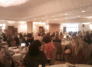
MOM 2.0 Summit Notes
 Keynote and opening remarks by Gretchen Rubin and Heloise. I have no photos of me in the panel, except the one I found online where I look like a startled rabbit. Which may not be far from the truth.
If you’ve paid any attention to my blog (as in, read the last post) or even seen me in real life (or noticed my absence for a few days), you may know that I was in Houston, Texas for the second annual MOM 2.0 Summit. I was a speaker/panelist in the web site usability and user experience session. I was paired with Angela Schmeidel Randall from Normal Modes and Sania Khan (blog at DesignBySania.com), both of whom were very bright women with a lot to offer. We managed to pow wow a couple times via Skype and again before our session, and the two of them had put together a PowerPoint presentation in advance (to be fair, they had more warning than I).
Other than some awkward microphone handling, we had fun getting our ideas across and fielding questions from the audience. After the session I fielded a few more questions from audience members, and even continued answering questions that night and through the next day. Based on the turnout, and the amount of questions, I’d say this was a popular topic — and we were up against the social media session, which was quite the draw I hear.
The MOM 2.0 Summit blog mentioned our session (Website Usability – Do The Expected.), and other than misspelling my name (easy to do when you are mostly talking about women), summarized it pretty well. What I thought interesting were the main ideas people seemed to take away.
For example, the blog mentions this point that I made:
Find people that don’t like you or don’t like what you do to give you honest feedback on the usability of your site
Out of context this advice can be a little tough to understand. Angela and Sania had both outlined different (very valid) methods for testing your site — free automated testing, focus groups, asking your grandmother, etc. — but I piped up with another idea to build on their points. I suggested you find dissatisfied customers or users, people who may not like you (and are less likely to gush), people who’ve had a bad experience with you before. They may be more likely to tell you what is wrong, what didn’t work, why they were peeved and to do it without worrying about sparing your feelings. I’ll distill this to two general outcomes:
- They talk crazy and in the end you discard their feedback; or
- They raise some very good points, you learn something and you may very well win back a formerly dissatisfied customer/user.
I’m hoping these general goals weren’t lost on everyone. I don’t think too many people were live Tweeting (there were only a handful of Tweets from our session, all the live Tweeters were in the social media session), but we did run through a lot of information in a very short time.
If you were in attendance, you got a shiny hand-out that Angela and Sania put together that contained a general web site usability checklist. If you weren’t there (for shame) then you can view the web site usability checklist that Angela keeps on her site.
If you were one of the kind folks who sought me out for questions afterward (and didn’t confuse me for another bald guy in the hotel), feel free to keep them coming. Hopefully I’ll see you next year and we can see how you’re doing on your project.
One Comment
Misty Khan (Arrow Tips) has been kind enough to collect all the post-Summit blog posts and provide links for the rest of us:
http://arrow-tips.com/archives/666
Leave a Comment or Response