Under-Engineered Text Boxen
This is the latest, and not last, in my informal series of posts on under-engineered controls. Generally I am looking at the minimum amount of CSS necessary to style native HTML controls while also retaining or improving accessibility and honoring different user preferences.
Last month I tweeted a bit of CSS to make the default text boxes of HTML (<textarea> and <input type="text">) less awful looking.
Planning to add more to my Under-engineered Controls series of posts. But my text input one may be briefest:
textarea, input[type=text] {
font: inherit;
}
Allows fields to scale with page / user text settings. That’s it.
That was, of course, over-simplified. <input type="text"> is not the only <input>type that accepts text; font styling is not the only change we can make to improve both appearance and accessibility.
Basic Styles
A more robust style might look like this:
textarea,
input {
  font: inherit;
  letter-spacing: inherit;
  word-spacing: inherit;
}
This short block of code is deceptively complex, or not.
font
The font property will inherit all the styles from the container(s). Some CSS resets will double up and use font-size, but that is not necessary. font will bring in the styles for each of font-size, font-size, font-family, font-style, font-variant, font-weight, font-stretch, and font-height (when set). It also brings in line-height. That also means it will adapt to changes you make to the page, either with add-ons or via browser / system settings.
letter-spacing
If a user (or author) adjusts the text to provide more space between letters, the default fields are not affected. Inheriting the font styles does not bring letter-spacing styles along with it, so you need to inherit letter-spacing as well. If you otherwise take steps on your page to support WCAG 2.1 Success Criterion 1.4.12: Text Spacing (grab Steve’s handy testing bookmarklet), excluding this declaration would prove disappointing for users who rely on that control. This style is in no CSS resets that I found.
word-spacing
Similarly to letter-spacing, the default fields will not inherit word-spacing styles unless you explicitly declare it. WCAG 1.4.12 applies for word-spacing as well. This style is also in no CSS resets that I found.
line-height
Note that I do not set line-height. It cascades from font in all the browsers I tested. If you find a case where it does not, likely due to explicitly setting line-height or more specific styles, then I suggest adding line-height: inherit to satisfy WCAG 1.4.12.
Example
The following example (available at CodePen and also in debug view to get rid of Codepen code) shows these minimum styles.
See the Pen Under-Engineered Text Boxen, Simple by Adrian Roselli (@aardrian) on CodePen.
Don’t Stop Here
You can potentially make text fields more usable and more accessible for your users with a few additional styles, tweaked for your own design. You can read a high-level overview of what to consider in my post Basic Custom Control Requirements.
Here is a version of the same styles as above, but with a couple more added and using a different selector:
textarea,
input:not([type="checkbox"]):not([type="file"]):not([type="image"]):not([type="radio"]):not([type="range"]) {
  font: inherit;
  letter-spacing: inherit;
  word-spacing: inherit;
  border: 0.1em solid;
  padding: 0 0.2em;
}
The Selector
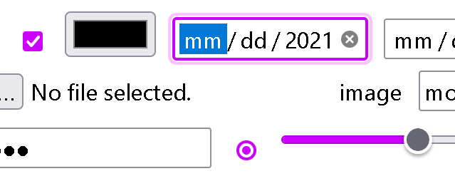
The most complex part of this entire block is probably the selector. As I mention above, there are more fields than <input type="text"> that can accept text. Generally we want to capture them all, with some exceptions. For example, we don’t want to overlap or override styles we have set on our Under-Engineered Custom Radio Buttons and Checkboxen.
We also have no need to style an image input, since arguably the image itself will do all the work of styling. File inputs and range inputs have default layouts across browsers that are more complex than just a box, so adding a border to them may be a bit much.
The :not() selectors exclude those input types. Since it is supported back to Internet Explorer 9, you don’t have to worry about leaving users behind. Of course, if you do not need to exclude these input types then you can dump the :not()s.
I make no effort to style the <datalist> because there is no reason to. The default styles are fine, trying to manipulate them is more complex than warranted, and then you have all the WCAG considerations from moving away from user agent default styles.
Additional Styles
The following two styles extend the basic styles above to hopefully make the text fields more usable.
border
Setting a border brings risk. Per WCAG (SC 1.4.11: Non-text Contrast), if you make no changes to the default styles of a form element you are not on the hook for contrast. But we want to make the control more usable. This style sets a thickness based on the font size, so it will scale with the text. It also makes the border solid, getting rid of the bevel you see in some browsers. I expressly do not set a color, letting the browser either leave it or set it to initial. If your page background is not white, you may want to adjust this.
padding
The padding is not necessary, but I have found in testing that fields are a little easier for users to read and use when there is some breathing room. It also makes the spacing between <textarea>s and <input>s consistent with one another, which is not the case in some browsers.
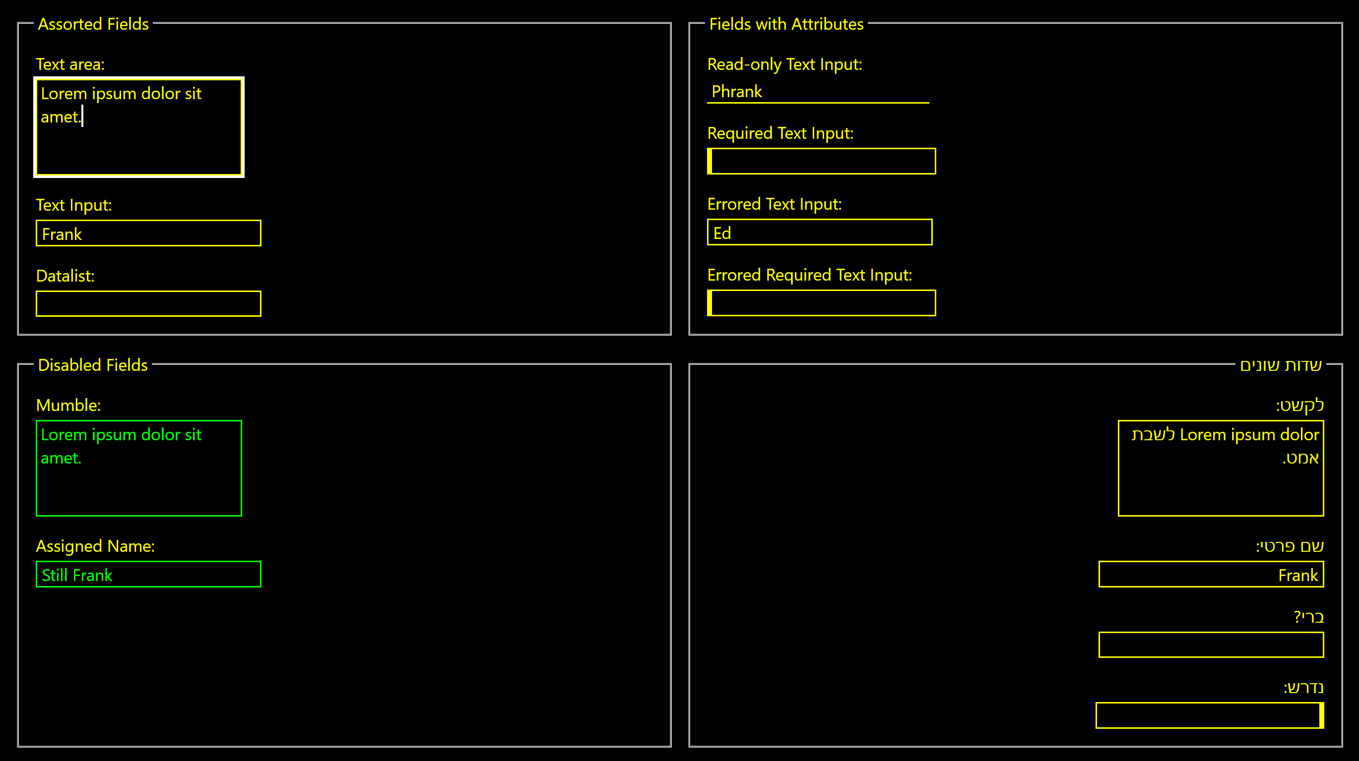
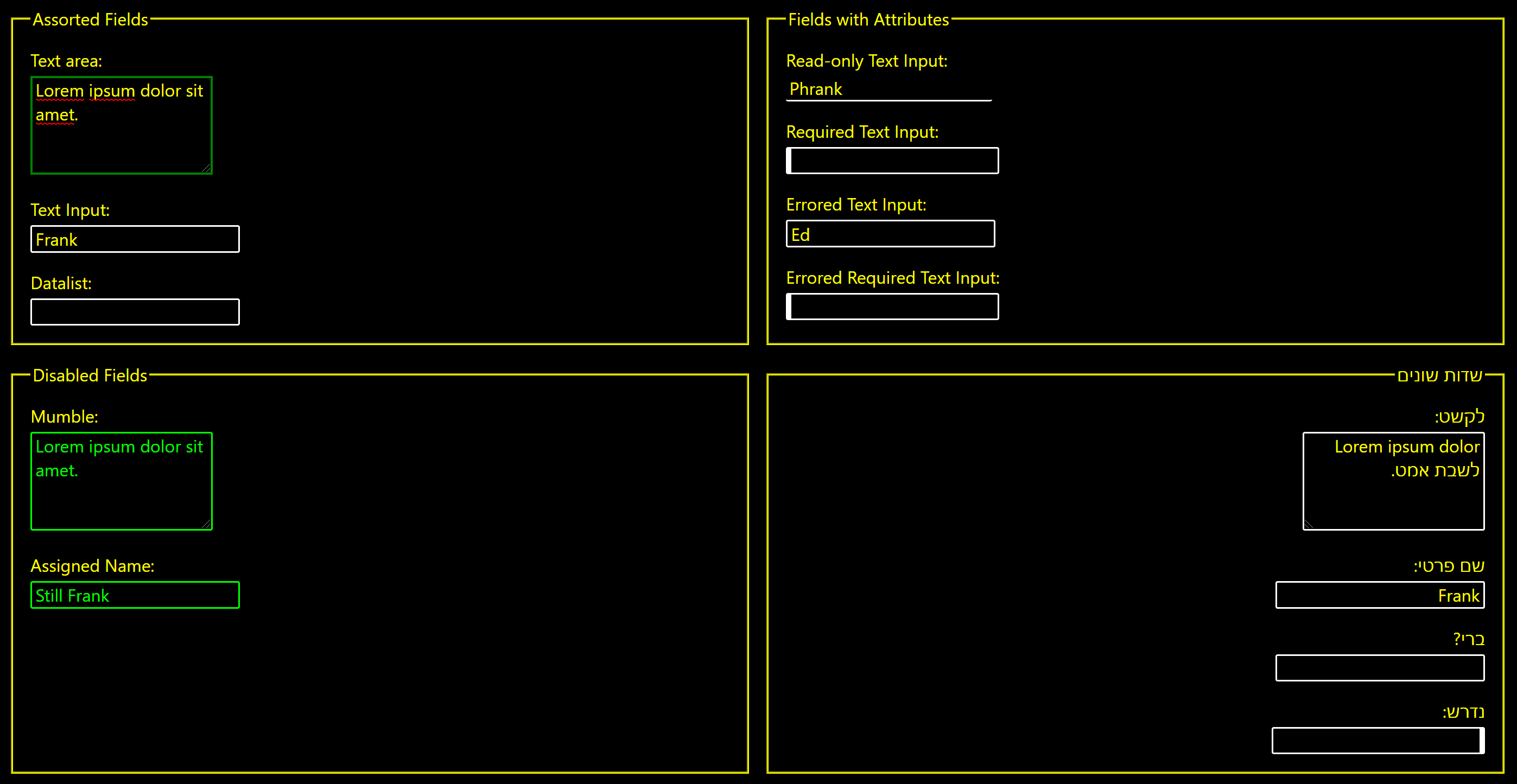
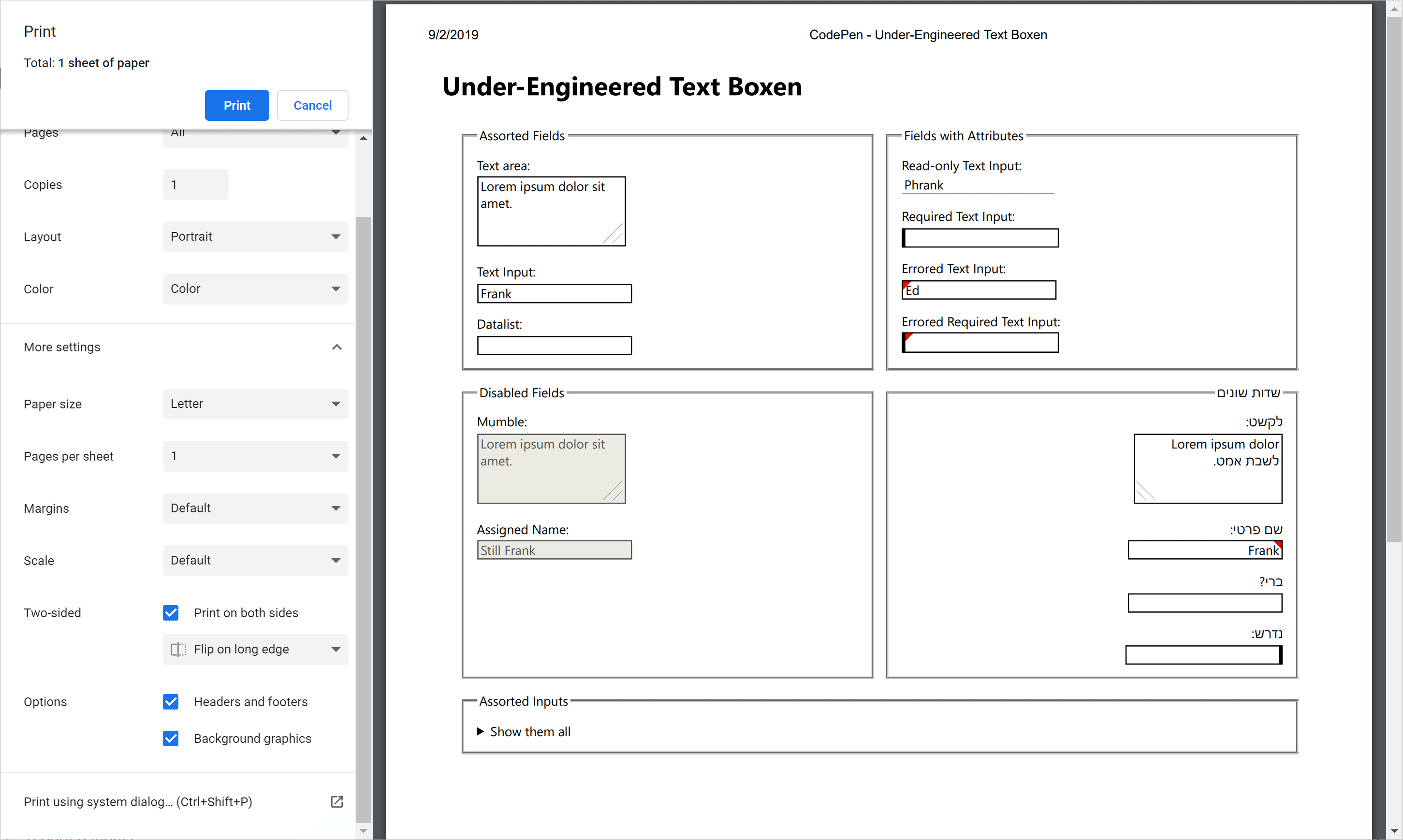
State Styles
Text fields can come in different states. Among others, disabled, focused, read-only, errored, and required are the most common I see in forms and also among the most inconsistently styled across the web. You don’t have to use any of the styles I propose, but you can use the selectors and thought process behind them to inform how you might implement them for your own pattern library.
Disabled
Disabled fields are excluded from WCAG contrast requirements, as are default interface controls. If you simply do nothing, the browser does the work for you. In the spirit of under-engineering, since I did not adjust the field background color nor text color, I can let the browser do the work.
Focused
WCAG SC 2.4.7 allows you to do nothing here, per Technique G149, because the browser adds its own focus style. As I argue in Avoid Default Browser Focus Styles, this just won’t do. I opt to use an obvious blue outline, with good contrast to white, and set a box shadow as well to make it even more obvious. I tend not to apply this to hover styles.
textarea:focus,
input:not([type="checkbox"]):not([type="file"]):not([type="image"]):not([type="radio"]):not([type="range"]):focus {
  outline: 0.15em solid #00f;
  box-shadow: 0 0 0.2em #00f;
}
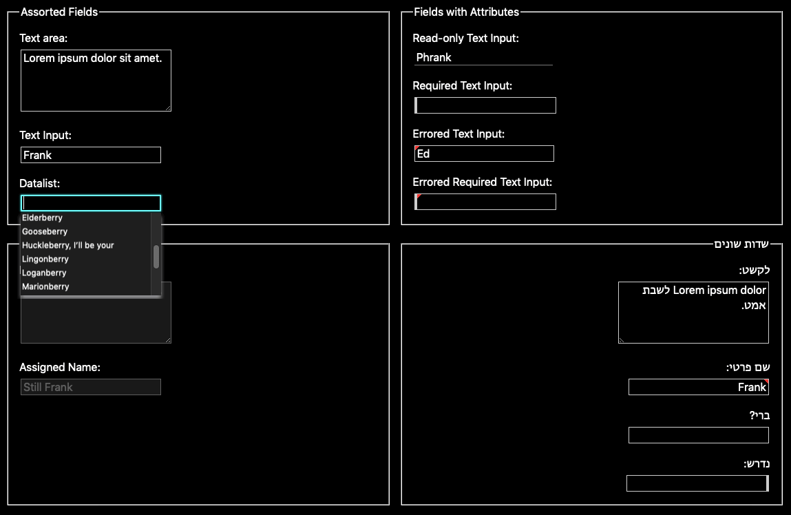
Read-Only
From experience, marking a field as read-only is confusing to users. I see this used when an author wants to dynamically make a field editable on a page and/or still keep it in the tab order. My first suggestion is to not use the readonly attribute on a field. But if you do, consider a style that is simple and implies that this thing is not like the others. Here I remove all but the bottom border, setting it to partially transparent black while still maintaining a 3:1 contrast ratio against white (my chosen background).
textarea[readonly],
input:not([type="checkbox"]):not([type="file"]):not([type="image"]):not([type="radio"]):not([type="range"])[readonly] {
  border-color: rgba(0, 0, 0, 0.42);
  border-left: none;
  border-top: none;
  border-right: none;
}
Required
As long as your label indicates a field is required (along with the required attribute), you don’t need to style the field any differently. A few years ago, however, I experimented with a visual style to reinforce the label and it tested well with users for that system. I thickened the border on the left and nothing more, which seemed to provide enough guidance at a glance. I do not change the color, continuing to let it inherit (from user agent styles by default).
textarea[required],
input:not([type="checkbox"]):not([type="file"]):not([type="image"]):not([type="radio"]):not([type="range"])[required] {
  border-left-width: 0.3em;
}
Errored
A red border, alone, will always be insufficient (from both contrast and color-alone WCAG failures) and massive drop shadows can muddy the overall page. In testing with users, too much effort to draw attention to errors creates noise, requiring multiple passes for users to address them all. Instead, I found that an indicator in the corner of the field did the trick. The gradient making the red mark sets the field’s background to white, the first time we explicitly set a field background color.
I skip :invalid in my selector because that keys off native browser error handling, which is often not what you want. I use the presence of aria-invalid instead, prompting users to add or remove the attribute, not just toggle it from true to false. The example code uses other values of aria-invalid only to remind you they exist.
textarea[aria-invalid="true"],
textarea[aria-invalid="spelling"],
textarea[aria-invalid="grammar"],
input:not([type="checkbox"]):not([type="file"]):not([type="image"]):not([type="radio"]):not([type="range"])[aria-invalid] {
  background: linear-gradient(135deg, rgba(255,0,0,1) 0, rgba(255,0,0,1) .4em, rgba(255,255,255,1) .4em);
}
Extended Example
The following example showing the expanded styles is also available at CodePen and has its own debug view to get rid of Codepen code.
See the Pen bGbBpGX by Adrian Roselli (@aardrian) on CodePen.
Internationalization Styles
I am going to cheat a bit here and just speak to right-to-left styles. I trust you who are more familiar with writing modes can adapt what I cover here to your use cases.
Conveniently, since we are using native text fields, we only need to adjust styles we made that lean on expectations from left-to-right languages, namely the required and error styles that position themselves based on where the user starts reading. Move the red mark and the thicker border to the opposite side and you are in good shape. Obviously there is a risk I am missing some cultural implications (in RTL Elbonian, a red triangle on the right might mean all is well and that you are late for supper).
*[dir="rtl"] textarea[aria-invalid="true"],
*[dir="rtl"] textarea[aria-invalid="spelling"],
*[dir="rtl"] textarea[aria-invalid="grammar"],
*[dir="rtl"] input:not([type="checkbox"]):not([type="file"]):not([type="image"]):not([type="radio"]):not([type="range"])[aria-invalid] {
  background: linear-gradient(225deg, rgba(255,0,0,1) 0, rgba(255,0,0,1) .4em, rgba(255,255,255,1) .4em);
}

*[dir="rtl"] textarea[required],
*[dir="rtl"] input:not([type="checkbox"]):not([type="file"]):not([type="image"]):not([type="radio"]):not([type="range"])[required] {
  border-left-width: 0.1em;
  border-right-width: 0.3em;
}
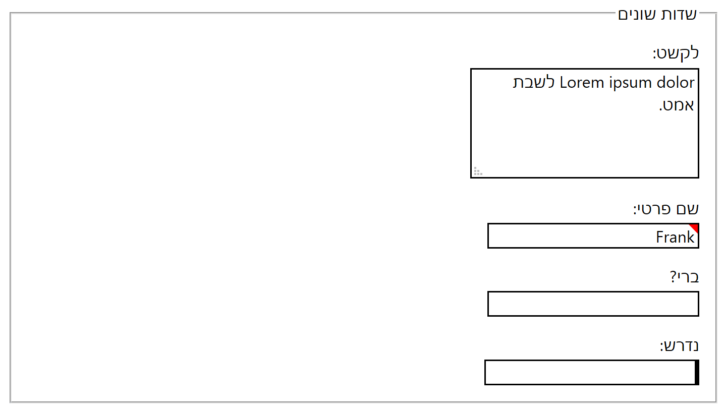
dir="rtl" is set; in this example the content is in Hebrew.Windows High Contrast Mode Styles
Because we are leaning on native controls, generally not messing with colors, letting system styles apply when appropriate, and avoiding styles for critical features that are dropped in WHCM, we don’t have much to do here. The outline style adapts fine, the disabled defaults work, and border styles do what they need to do.
The only thing we lose is the error indication. With so few (WHCM system) colors to choose from, you would have to lean on another visual indicator for errors. At that point, you are relying on your field labels to clear denoting errors.
WHCM Update: January 19, 2020
The new Chromium-based Edge (ChromiEdge) does not honor WHCM quite the same as in legacy Edge nor Internet Explorer 11, for which I have filed issues, so you will need to test your styles now and when this gets sorted.
Print Styles
Because you are scaling the border thickness based on font size, you can ignore that as the user is likely choosing a font size that is legible. The backgrounds of the disabled and errored fields can be controlled by the user in print settings. As long as you set a page text size in your print styles, there is nothing for you to do here.
Dark Mode Styles
As dark mode is a feature query that you have to create styles to support, this is all on you. You will have to choose a background color and font color and go from there. Conveniently, you can override colors alone and be in a better position than writing all new styles from scratch. In these example styles I assume a dark mode of white text on a black background.
You will need to inherit the text color and background (or make it transparent) and choose a border color that still passes contrast requirements. The focus styles also need sufficient contrast. The error state relies on a background gradient to white, so you will need to redefine the error styles all over, including for RTL. The disabled fields will also need some work, since you are explicitly setting border and text colors now.
@media screen and (prefers-color-scheme: dark) {
  textarea,
  input:not([type="checkbox"]):not([type="file"]):not([type="image"]):not([type="radio"]):not([type="range"]) {
    background-color: transparent;
    color: inherit;
    border-color: #ccc;
  }
  textarea:focus,
  input:not([type="checkbox"]):not([type="file"]):not([type="image"]):not([type="radio"]):not([type="range"]):focus {
    outline-color: #0ff;
    box-shadow: 0 0 0.2em #0ff;
  }
  textarea:disabled,
  input:not([type="checkbox"]):not([type="file"]):not([type="image"]):not([type="radio"]):not([type="range"]):disabled {
    border-color: rgba(255,255,255,.3);
    color: rgba(255,255,255,.3);
    background-color: rgba(255,255,255,.1);
  }
  textarea[readonly],
  input:not([type="checkbox"]):not([type="file"]):not([type="image"]):not([type="radio"]):not([type="range"])[readonly] {
    border-color: #777;
  }
  textarea[aria-invalid],
  input:not([type="checkbox"]):not([type="file"]):not([type="image"]):not([type="radio"]):not([type="range"])[aria-invalid] {
    background: linear-gradient(135deg, rgba(238,0,0,1) 0, rgba(238,0,0,1) .3em, rgba(0,0,0,0) .3em);
  }
  *[dir="rtl"] textarea[aria-invalid],
  *[dir="rtl"] input:not([type="checkbox"]):not([type="file"]):not([type="image"]):not([type="radio"]):not([type="range"])[aria-invalid] {
    background: linear-gradient(225deg, rgba(238,0,0,1) 0, rgba(238,0,0,1) .3em, rgba(0,0,0,0) .3em);
  }
}
Wrap-up
You can do a lot with native HTML text fields using just a little CSS. When you do style your own fields, look to the minimum styles you need to make them fit with your overall design and still support the cases I outline above. You don’t need to do them all, but I recommend you at least consider (and test) options.
Update: 24 March 2022
If you are hoping accent-color will be your friend now that it has support across all major browsers, it will not help here. It only works with checkboxes, radio buttons, range sliders, and progress bars. There is a write-up at CSS accent-color and a test page.
However, in Firefox it becomes the default focus ring color if you do not otherwise have a custom focus style. So ensure it has good contrast.
8 Comments
You should file a bug against all affected browsers to include the CSS to inherit font attributes in text boxes. Sane default styles should be the responsibility of browser vendors, not web developers.
In response to . ‘Sane’ is a relative term, and some browsers do better than others. That being said, I opted against doing that owing to the work Greg Whitworth (from the Edge team) kicked off through the Open UI repo (also at open-ui.org), which he initially described in his post Initial thoughts on standardizing form controls. Also, IE11 is not going away soon so some effort by authors will be needed for some time.
In response to . I feel like superlupo and I looked at the current specification for “suggestions [to UA] for rendering HTML documents” and it looks like input elements should have ‘initial’ as the default value for letter spacing.
https://html.spec.whatwg.org/multipage/rendering.html#form-controls
I suppose that user settings would apply in Chrome/Firefox/? if they were not applying ‘normal’ for letter spacing of input elements, as letter-spacing is an inherited property by default.
Nice work by the way. Thank you for sharing.
I ended up using explicit input type selectors, rather than exclude certain types with
input:not([type="checkbox"]):not([type="file"]):not([type="image"]):not([type="radio"]):not([type="range"]), to avoid the 0/5/1 specificity of this selector, which made it harder to override later.
Any reason this wouldn’t quickly solve the dark mode issue instead?
filter: invert(100%) hue-rotate(180deg);
In response to . Sure? Just make sure you have a good selector. Note for that to work it presumes you are using black and white, not maybe yellow and blue as your dark mode style.
In response to . Hi Christopher,
This is a cool idea that I remember Heydon Pickering also mentioning. I tried it out for fun on some sites, but it creates a new stacking context, so z-index issues can creep in. Tried ot for example in a Salesforce instance. Hope this helps.
Thanks for making this information available.
I just wanted to add another way the
inputselector can be written for current browsers:
input:not([type='checkbox'],

[type='file'],

[type='image'],

[type='radio'],

[type='range']) {

  font: inherit;

  letter-spacing: inherit;

  word-spacing: inherit;

}
I think it’s easier to read and understand if you don’t have to support old browsers.
Leave a Comment or Response