OS: High Contrast versus Inverted Colors

There are different ways to make a web page more easy to read, but there are two options that come directly from the operating system that many developers and designers seem to confuse — high contrast and inverted colors.
While the confusion may not be a big deal in most contexts, when talking about implementing support for each it can be critical to know which one you are targeting. Those of who practice the dark arts of accessibility want to be as precise as possible when testing and implementing.
This post is not a judgment about either approach. They both are useful for users in different contexts and do what each says on the tin.
Windows High Contrast Mode
Since Windows 7, users have had the option to apply a color scheme in Windows that reduces the total system colors to a smaller set with much greater contrast than otherwise. While there are some pre-set themes, users can customize the colors as they see fit. The keyboard shortcut to enable it is Left Alt + Shift + Prt Scrn.

Visible Effects
Background images, including gradients, are discarded in Internet Explorer and older versions of Edge. Newer versions of Edge retain background images, but put a solid color block over the image when there is text. I have written more about this in my post CSS Background Images & High Contrast Mode. System colors are applied to text, backgrounds, and form controls. Eric Bailey outlines the CSS keywords you can use to select those colors in slides from his a11yTOCamp talk, Working with High Contrast Mode. Greg Whitworth has also written some practical advice on accounting for high contrast mode.

Support
Internet Explorer and Edge both support Windows High Contrast Mode. While this is a system-level change, with the exception of Firefox, other browsers do not adjust content to match. I have dropped a screen shot of Firefox way below so you can compare.
Media Queries
You can detect if Windows High Contrast Mode is active with non-standard media queries that are only supported in Internet Explorer and Edge.
@media screen and (-ms-high-contrast: active) { /* All high contrast styling rules */ }
@media screen and (-ms-high-contrast: black-on-white) { /*  */ }
@media screen and (-ms-high-contrast: white-on-black) { /*  */ }
You can then make adjustments to your content, such as not relying on background images or styling controls to be more obvious. Whenever possible, avoid setting any colors, though if you use system colors be sure to test.
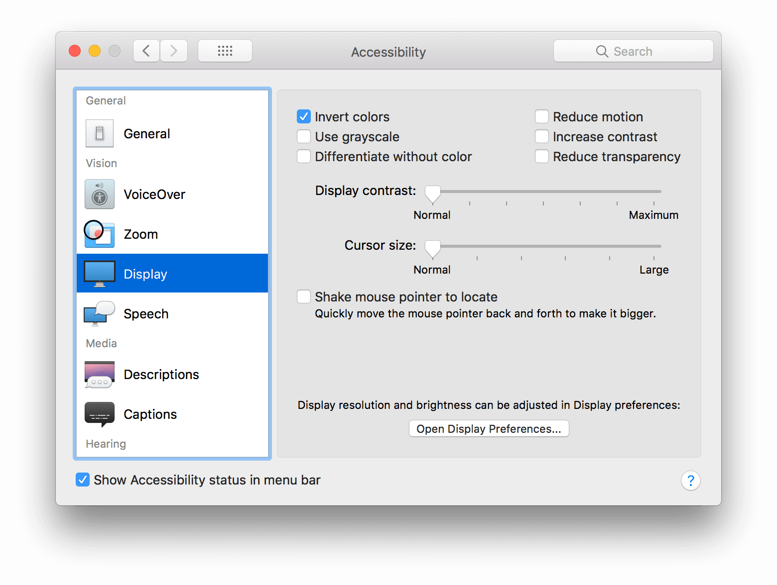
macOS Invert Colors Setting
This feature has existed since at least Mac OS X 10.7 Lion. The keyboard shortcut to enable it is Ctrl + ⌥ + ⌘ + 8 (though I understand the shortcut is disabled by default).
Visible Effects
The colors on a web page will be inverted, much like the CSS filter, running the invert filter in Photoshop, or looking at the negative of a photo. Essentially, a color is replaced with its opposite, including black and white. If a page already has poor contrast, this does not increase the contrast, though the color swapping may improve perception for some users. You will see in the screen shot that images are inverted as well. At the OS level, the smart invert is supposed to not invert images.

Support
Because this is a system-level inversion of the colors, it impacts the entire operating system, including all browsers and the content within them.
Media Queries
Safari on macOS High Sierra supports the inverted-colors media query. While this media query was planned for CSS Media Queries Level 4, it has been kicked to Level 5, so its standards-track speed has slowed. PPK offers a quick support test on his site.
@media screen and (inverted-colors: inverted) { /* All inverted color styling rules */ }
You should be careful how you use this media query, since a user typically flips to this mode for a reason. At the very least, you can use it to un-invert (unvert) images on a page.
Update: March 30, 2018
While I could not get the smart invert feature to work, meaning images and video were inverted along with the rest of the page, it sounds like Safari may be addressing this:
Safari Tech Preview double inverts images and video when on 'invert colors' mode in the OS, so they appear normally while the rest of the UI can have the inverted colors. Sweet!
Comparisons
I am just Dropping some images in here for visual comparison. No new information.


Wrap-up
Invert color is particularly handy for reading bright pages in a low-light setting. It does nothing to increase the contrast. High contrast mode is handy for creating contrast where there is too little contrast on a page. It may be annoying in a low light setting if you use the default them and the page has a lot of elements that use the brighter colors.
You can approximate the macOS invert color setting with my invert color bookmarklet. The bookmarklet unverts images and video. I also have instructions to make the bookmarklet work on mobile devices.
You may have noticed that the macOS screen shot shows an option to increase contrast. That is not the same as a high contrast mode, and mostly works like the contrast slider in Instagram.
You also may have noticed that my Windows settings dialog was dark. This is not from Windows High Contrast Mode, this is because I run Windows (and Office, and Firefox, and so on) with a dark theme to help my eyes and my battery.
Update: April 6, 2018
Matthew Atkinson has written a series of posts about color and perception, but it never occurred to me to link this post of his (which was released after I wrote mine): How “invert brightness” can improve accessibility and help us use our devices
Update: February 27, 2018
With Microsoft replacing the engine of Edge, it makes sense that it would want to implement support for High Contrast Mode in the new engine. The High Contrast Explainer Microsoft put together for the CSS Working Group is the first step in standardizing it.
Update: August 7, 2018
Greg Whitworth tackled a question I posted on Twitter first by responding with handy detail, and then by blogging about it: Working with the text backplate in Windows High Contrast
Spoiler: if you are doing a good job of using WHCM and are trying to visually invert controls for hover/focus states, then -ms-high-contrast-adjust: none; can be just what you need.
Update: January 15, 2020
ChromiEdge, the new Chromium-based Edge browser, is out today. Its support of WHCM-specific styles is… different than legacy Edge and IE. I filed a bug: Issue 1042012: High Contrast Mode inconsistencies with Legacy Edge, IE11. I also tracked it in a brief Twitter thread.

forced-colors MQ support in ChromiEdge?Update: January 28, 2020
Eric Bailey wrote Operating System and Browser Accessibility Display Modes at The A11y Project, where he goes into detail about other viewing settings.
Update: May 28, 2020
Sarah Higley has some handy tips about how to use and what to expect from Windows High Contrast Mode in her post Quick Tips for High Contrast Mode.
Update: February 10, 2021
I have post that goes into much more detail about WHCM, system colors, CSS forced-colors mode, and Windows 11: WHCM and System Colors.
5 Comments
The Windows 10 Fall Creators Update includes Color Filters in addition to High Contrast. Users can apply filters including inverted, grayscale, grayscale inverted, deuteranopia, protanopia, and tritanopia. The latter 3 are specifically designed to make colors easier to discern for people with color blindness.
In response to . Jeff, thanks for the note. I casually referred to other features in the screen shot for the dialog, but kept this post focused on just the high contrast feature. Since I have your attention, are you aware of any media queries to target those new features?
My vision is deteriorating due to glaucoma, so I have strong interest in both High Contrast and Dark Mode features. I am using Google Sheets across multiple platforms; including my Android phone and tablet, and Microsoft Server 2008 r2 standard (soon to be upgraded). When I open my sheet in Server 2008, it shows initially in Dark Mode – which I want, as it is easy to read, but after about 1 second, it switches to light mode, with most of the text in white, on a white background – basically invisible. I am trying to find settings to keep Server 2008 from reverting the doc to light mode, but haven’t found. The text appears to be staying white which would be appropriate for dark mode, but with the standard light background, makes the text invisible. Any help is appreciated.
In response to . Lee, I am in no position to help, but @MSFTEnable on Twitter may be able to. Otherwise, considering support for Server 2008 ended as of January 14, 2020, I doubt the response will be anything other than a suggestion to upgrade.
I noticed some wrong information in this otherwise great and valuable blog post.
You wrote “Invert color […] does nothing to increase the contrast” but that is not true. It increases the contrast a bit or a lot or sometimes it even decreases the contrast and sometimes it stays the same, depending on the colours.
“If a page already has poor contrast, this does not increase the contrast” is not always true, either.Your website’s colours, for example, would increase their contrast when inverted, although only a little bit.
#000000 on #efefef => 18.26
inverted: #ffffff on #101010 => 19.03A more extreme example which increases its contrast much more when inverted:
pure red on white => 4:1
inverted: cyan on black => 16.75:1But if you had cyan on black to begin with, that would obviously decrease the contrast a lot when inverted.
A higher colour contrast ratio as calculated according to WCAG standards will not necessarily mean that text will be easier to read, but that’s a different story.
Leave a Comment or Response