Avoid Messages Under Fields
Sometimes we fail to consider how browser features can jack up our interfaces. This is neither good nor bad, but we do need to account for it.
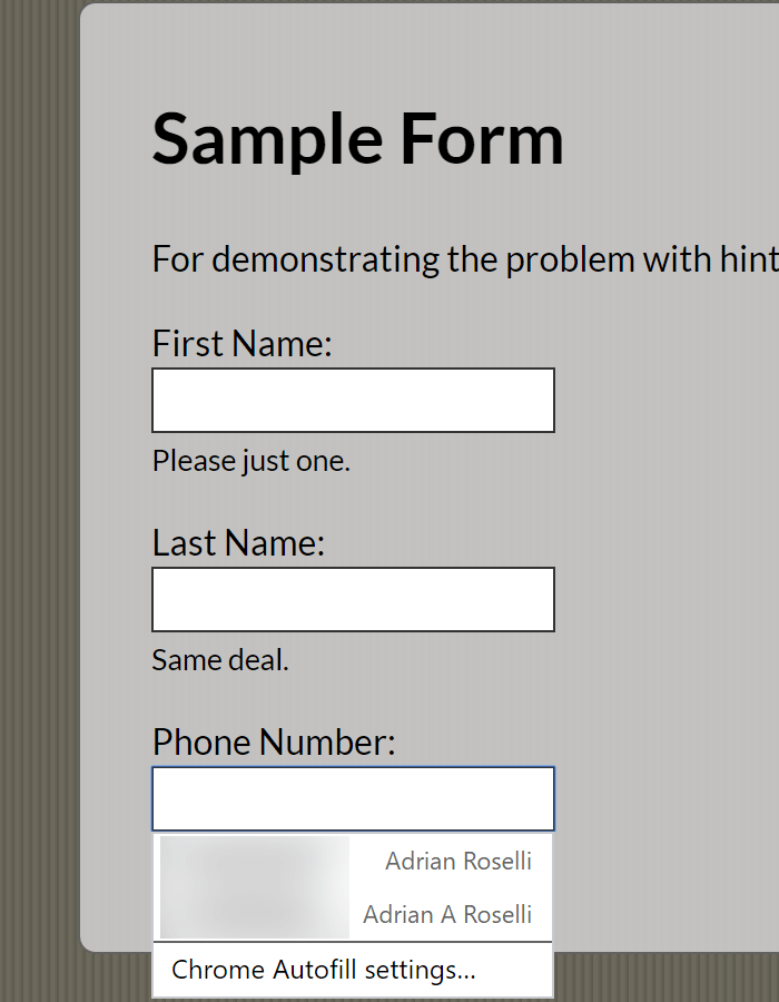
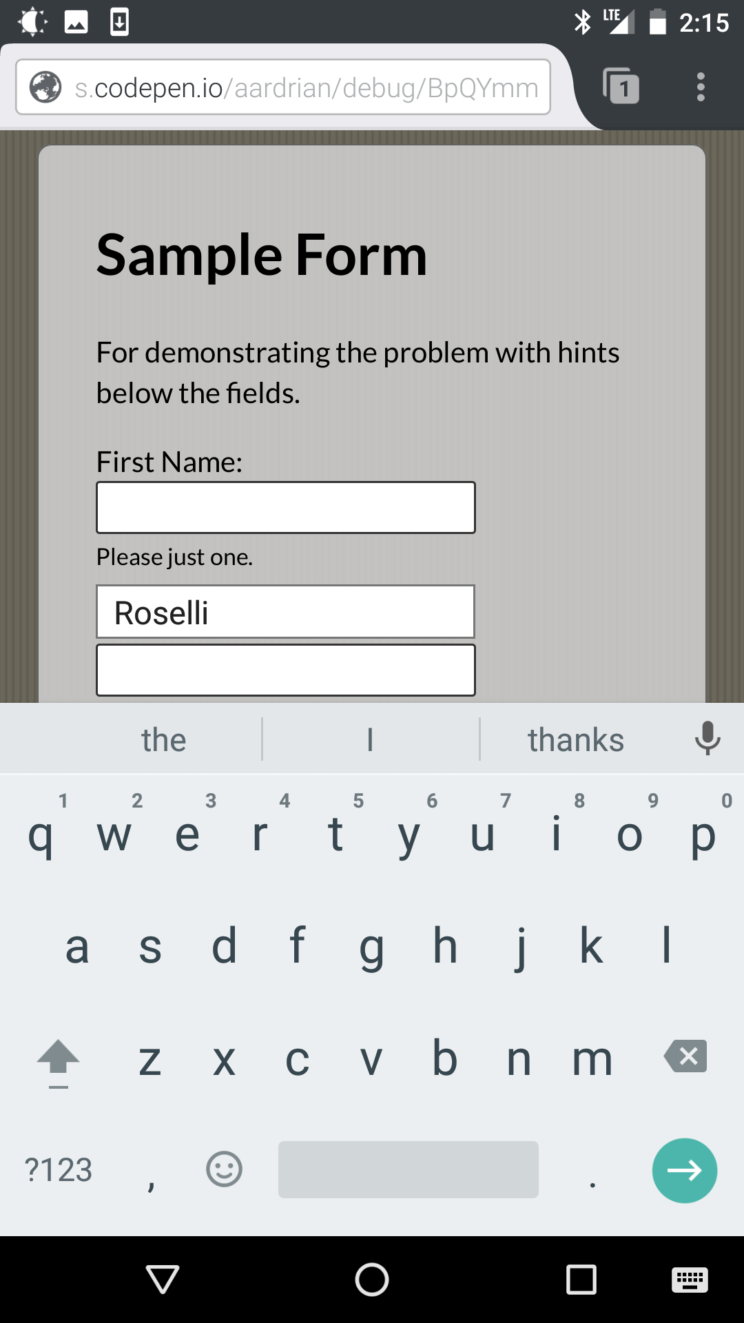
My argument here is simple. Avoid putting important actionable or informational text exclusively below form fields. This includes labels, hints, and error messages. Here is why:
- Auto-complete features in browsers obscure them.
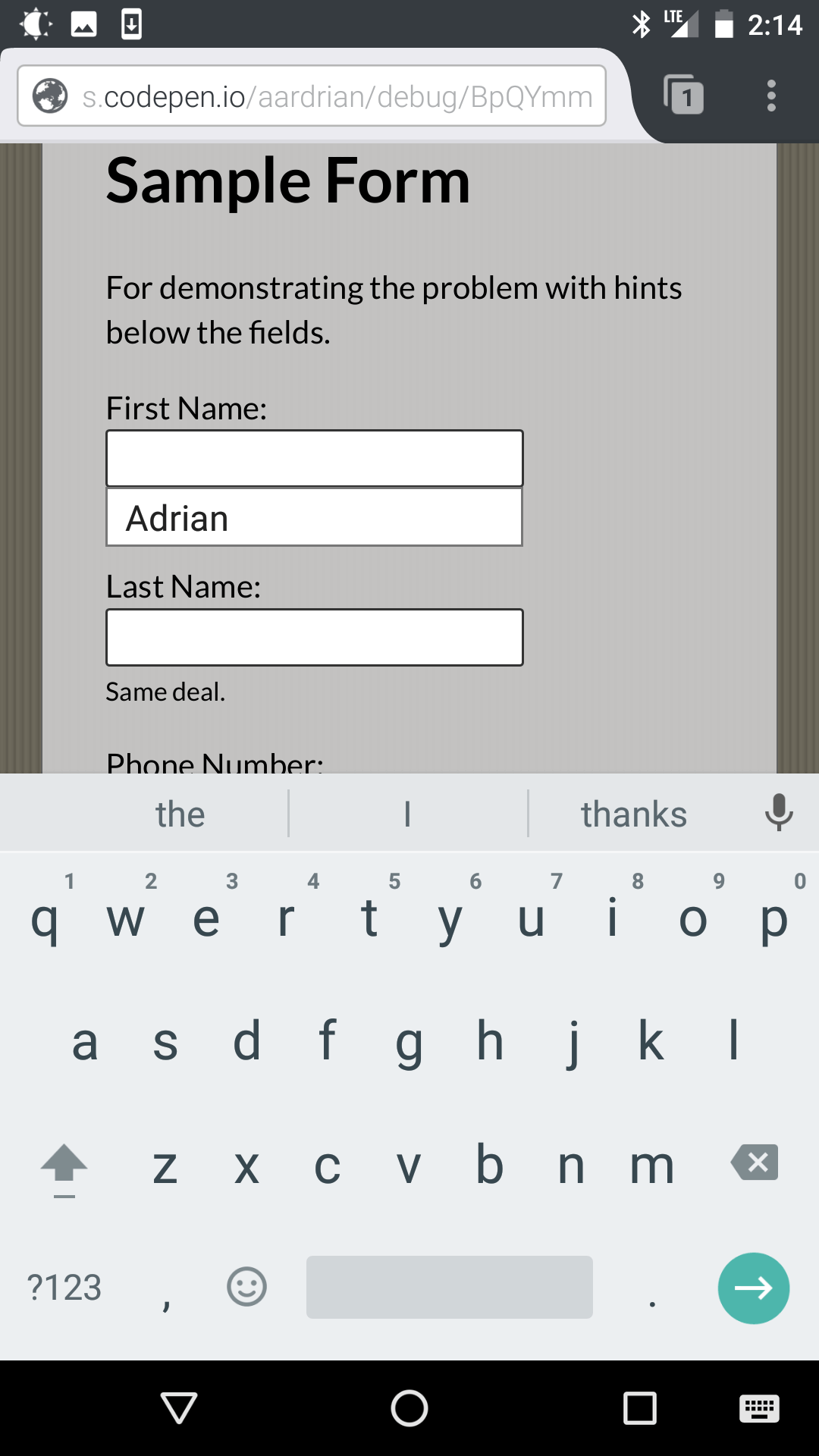
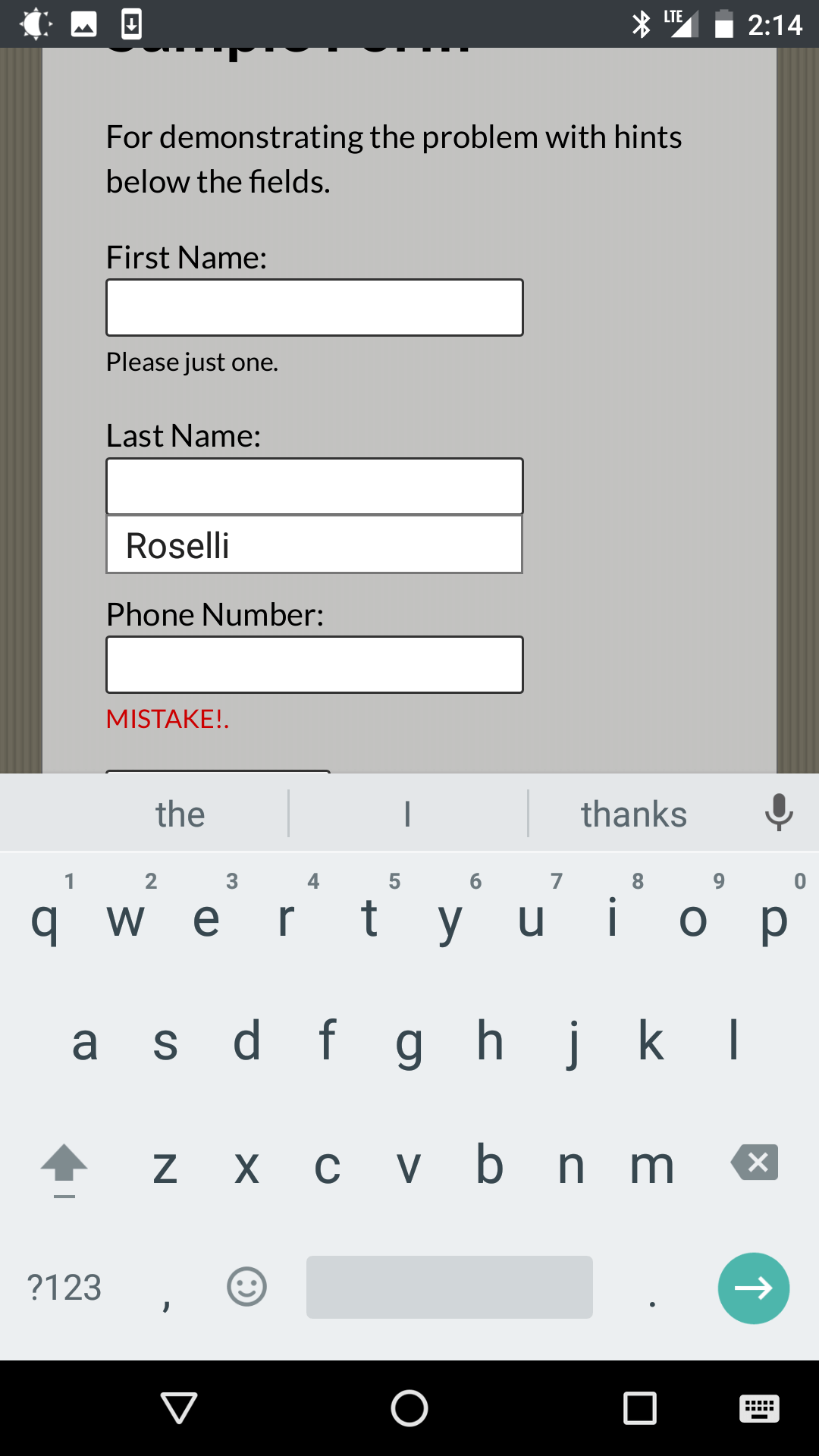
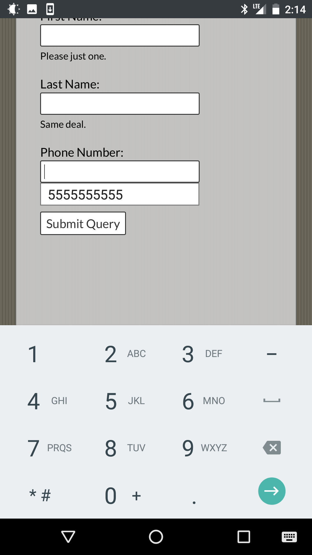
- On-screen keyboards can obscure them.
- Depending on how you programmatically associate this text with form fields, it may be an anti-pattern to announce afterward in screen readers.
There are exceptions, of course. But that is why I use the word avoid and not the word don’t.
One way to mitigate this can be as simple as pushing the text a bit to the left (for left-to-right languages like most Western languages) as the auto-complete menu does not appear to ever go further left than the edge of the field. Another way could be to use an additional indicator of content, or even duplicate some important parts of content (as some of us already do with error messages first in an overall list and then per field). I leave it to readers to identify a solution best suited to their designs, users, and needs.
Demo Form
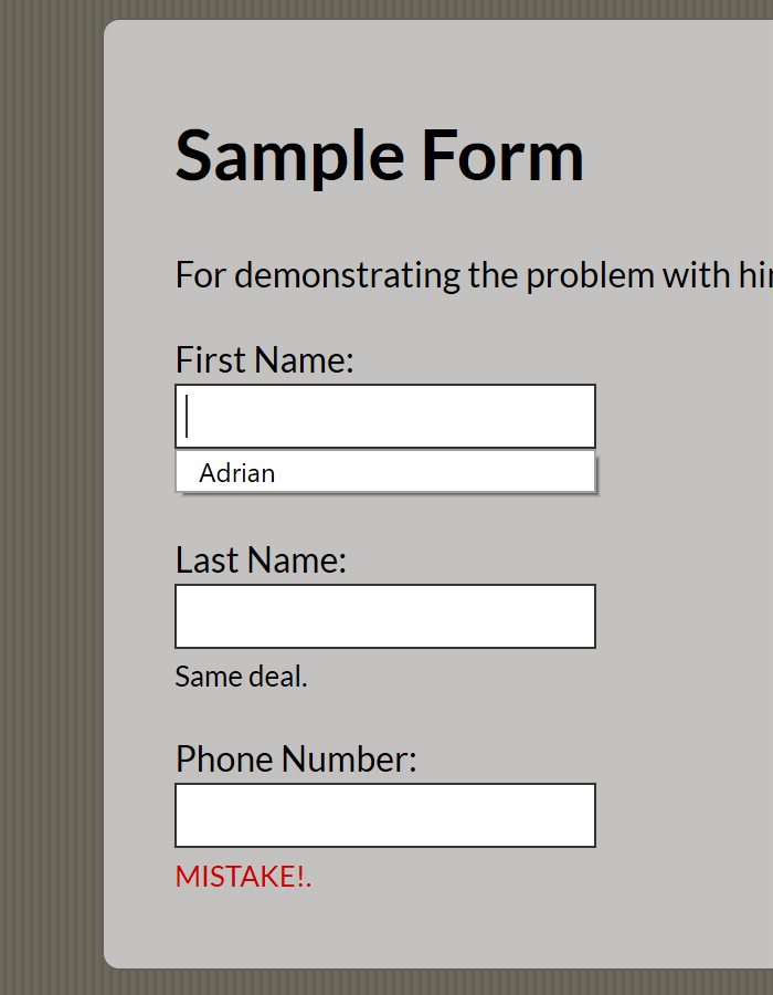
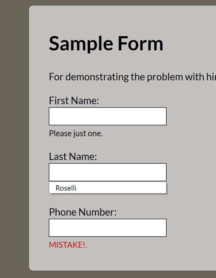
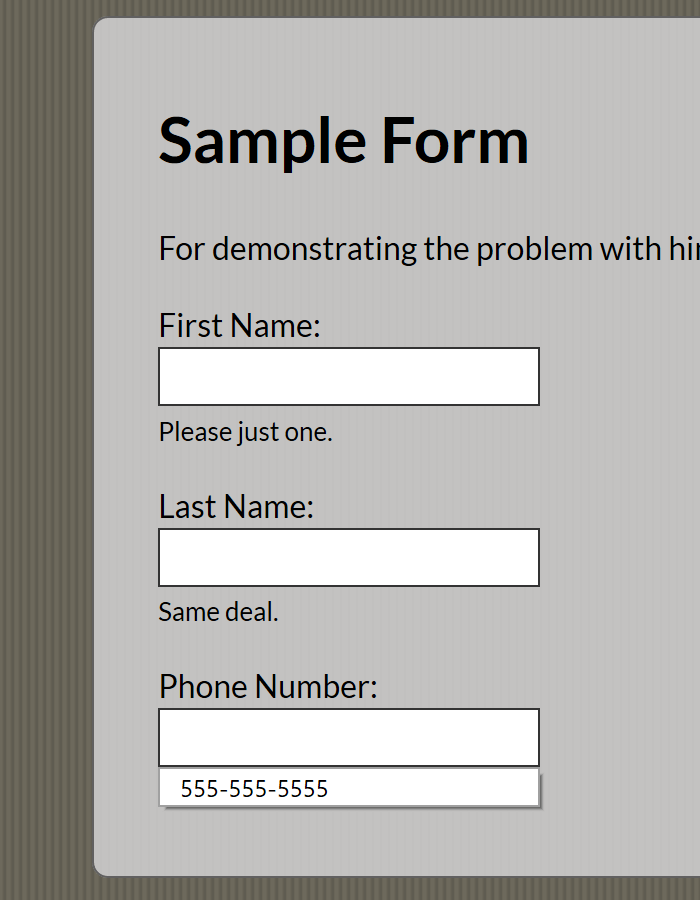
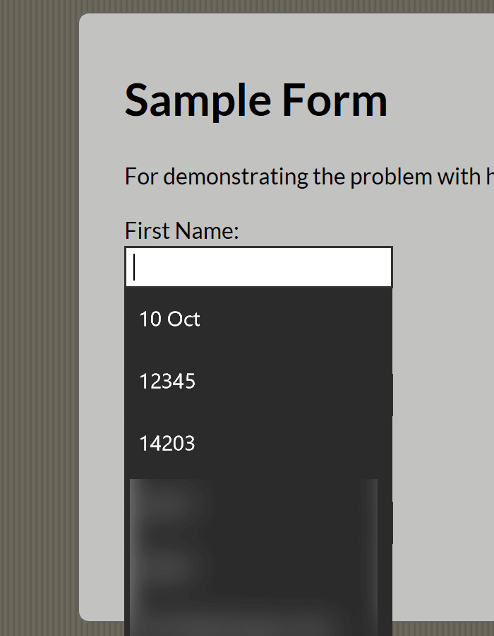
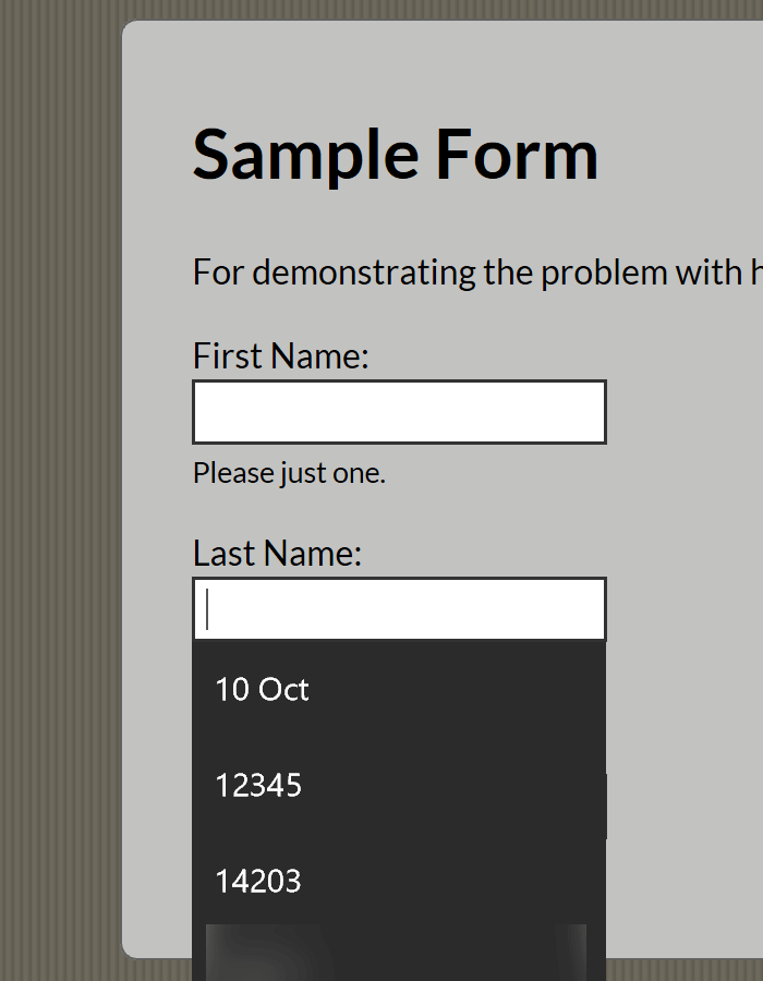
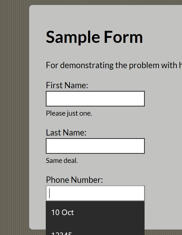
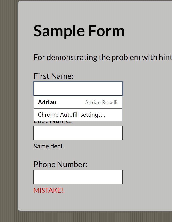
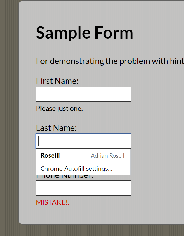
I made a sample form with common fields that for all of my browsers already have auto-complete data. You can load the debug version in your browser of choice, as it gets rid of all the CodePen script.
See the Pen Sample Form by Adrian Roselli (@aardrian) on CodePen.
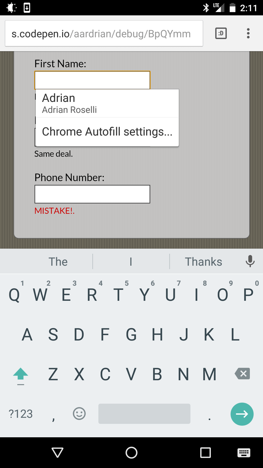
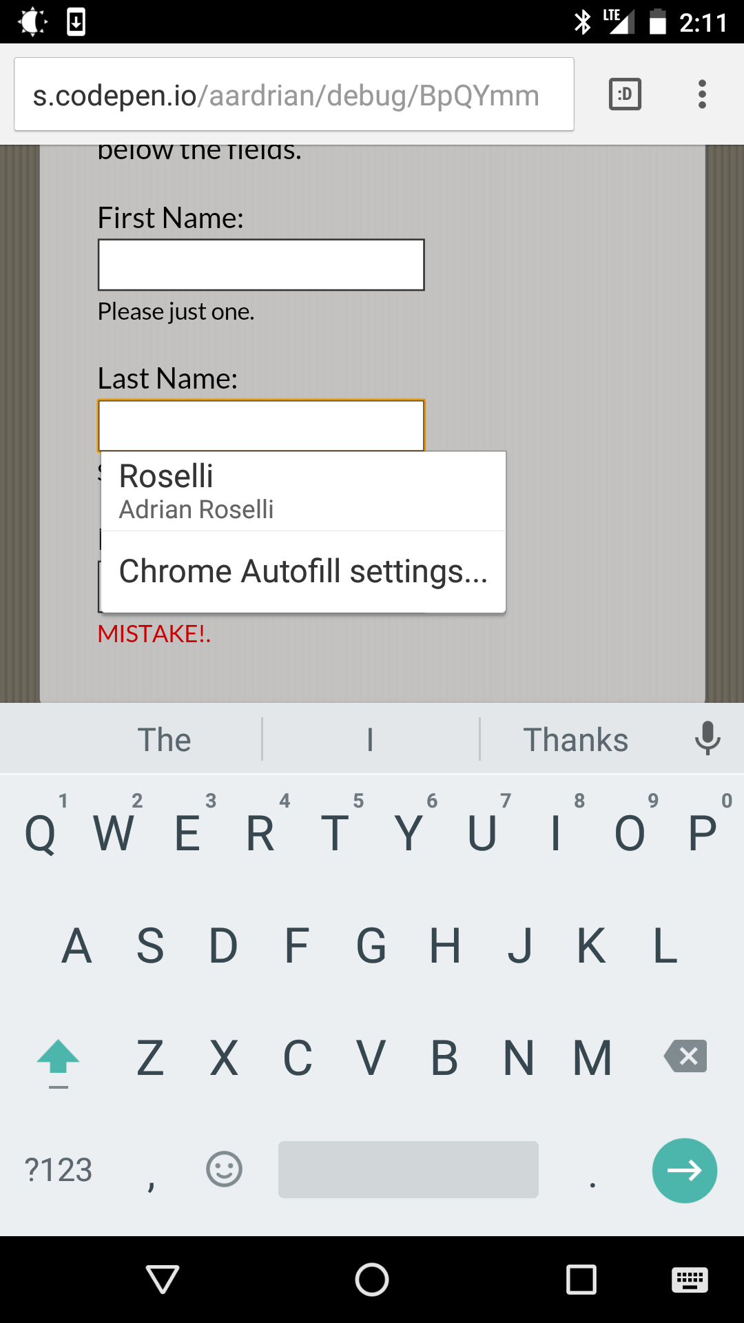
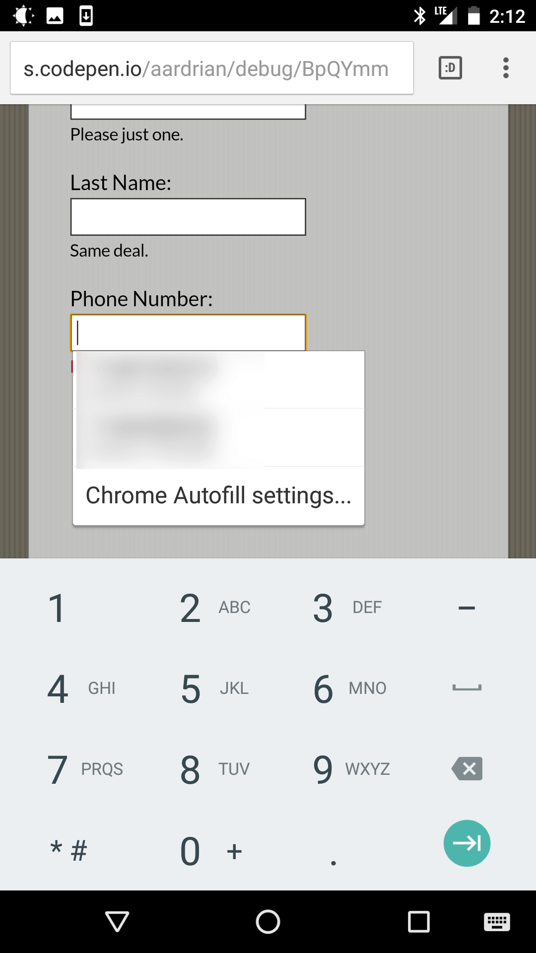
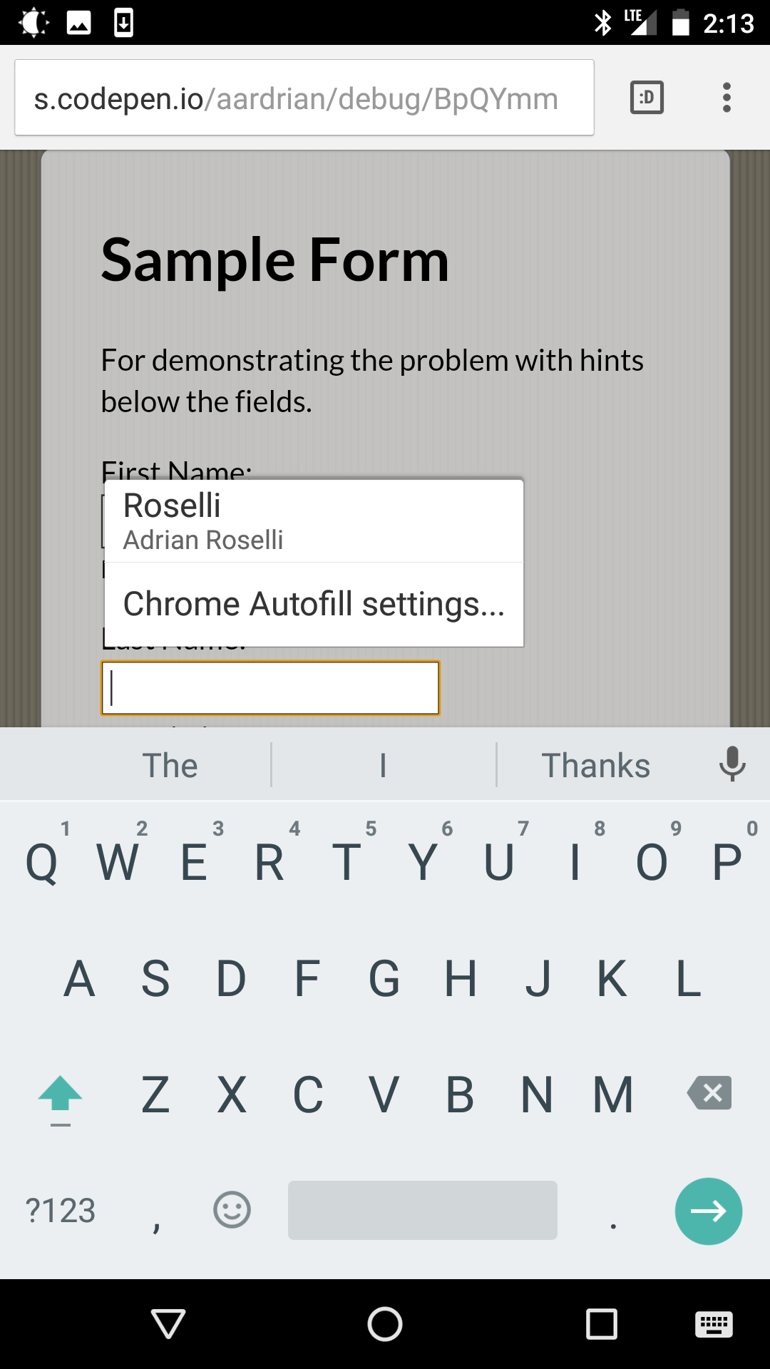
Screen Shots
I have gathered screen shots from a handful of browsers immediately at my disposal while procrastinating in a cafe.
Desktop Browsers
Mobile Browsers
Wrap-up
This is not a big issue, but with some careful attention to detail you can make forms on your site a little more user friendly (or less user unfriendly). Consider if there are other elements on your site that can benefit from accounting for built-in browser features.
Update: 11 April 2017
I ran into a variation on this example in the real world while ordering stuff online. When your below-the-field informational text becomes the error message, then things can get annoying pretty quickly. Hilariously, I experienced both the examples below on the same field, the second time as a result of reloading the page to try to see the hint text and clicking to avoid over-tabbing.
Update: 4 May 2022
Chromium and Firefox browsers display the default / native error messages below fields. In Chromium browsers, those messages go away after 5 seconds. Add browser auto-complete and hints into the mix, and you get some problematic interfaces. My general advice is to avoid default field validation. Then you get to choose where to put the message.
6 Comments
Great point Adrian. With autocomplete off, it seems like less of an issue, but I definitely see how it can cause problems with it there. It almost seems like the experience with AT might be better in those instances :-)
I am curious (since you didn’t include a link): Could you provide an example of when you may not want the associated helper text to be read after the field?
In response to . Aaron, thanks for the comment. While disabling auto-complete does indeed address this in many cases, my experience with user testing is that users on the whole do not disable it. I wish I had solid numbers on this, but at the very least I am advocating for users who surf with browser defaults.
When you ask for an example of helper text read after a field, I assume you are asking about it in the context of a screen reader. So I will run with that.
A fake example would be a generic error message that, even if appropriately associated with a field, can still be encountered on its own out of context. So if I have an error message that says “field cannot be blank” after the affected field, and then I start moving along the page and encounter it before the next field I can wrongly assume it relates to the next field.
Sadly, the example I have seen in the wild that is in my head is from a specific client project so I cannot share it. I can probably make a mock-up and record a video if you like, but it won’t be today.
In response to . Thanks for the clarification Adrian! That makes sense :-)
Great article. I was wondering if displaying the message for the correct input as the placeholder text in the field itself may help. When the user clicks on the field the placeholder gets aligned to right side of the field. Now this may not work for larger inputs but it may help. What’s your thought?
Here’s a code I found which does the kind of same thing I mentioned: http://jsfiddle.net/csdtesting/wbqq129q/
In response to . My immediate reaction is that it is too easy for the user-supplied text to overlap the relocated label text. Even when it does not overlap, it may be confusing for users with some language disabilities as it puts more characters in a field that should only contain their information. That pattern may have some value in a very specific setting, but as a general practice I would not use it. For your example, you would need to kick the contrast way up too.
One way to mitigate this can be as simple as pushing the text a bit to the left (for left-to-right languages like most Western languages) as the auto-complete menu does not appear to ever go further left than the edge of the field.
This fails in Safari. Here is a sample screenshot.
I like what the GOV.UK Design System recommends here . Though their approach increases the distance between
and, thus splitting the clickable area that folks expect around an input.As a work around to the split, putting all text within the would work, as demonstrated in this Code Pen.
This approach solves the split problem, while also increasing the tappable area around the input. Though I am not sure how I feel about it. It feels like I am ignoring other approaches like
aria-labelledbyoraria-describedby.Appreciate any thoughts.
Leave a Comment or Response