Accessible Emoji, Tweaked
Léonie Watson recently posted Accessible Emoji, a simple technique to make emoji characters accessible to those with screen readers. It requires a little bit of extra effort when inserting an emoji into a web page, but it is worth it to convey the meaning to screen reader users.
Then there are users like me, who cannot tell when an emoji face is laughing or crying, or who cannot tell the difference between a peach and an eggplant emoji. You can imagine what this has done for my dating life.
Borrowing a little from a tool-tip-ish CSS-only example from Russ Weakley, I have enhanced Léonie’s example to make that handy aria-label display when the mouse hovers over the emoji. Add an unfortunate tabindex and now a keyboard-only user can put focus on the emoji.
I set bottom of the tool-tip relative to the top of the emoji, allowing for very long explanations that do not hide the emoji itself. I also use a bit of animation to make it visually more apparent from where the tool-tip is supposed to spring. If you find the animation is problematic for users you can just drop the reference and all works fine.
I included print styles so that even when printed users like me will benefit from the additional context for the emoji (or users like my parents who still print articles to read them). Which is a great reminder to never forget your print styles (I have written on this extensively).
The text scales with the base font size. Make sure the max-width limits the tool-tip from shooting out of the window. I did not include any Windows High Contrast Mode styles as the existing styles lend themselves well to be overridden.
Embedded Demo
If the embedded block below does not render, head on over to CodePen to play with it there or visit it in debug mode to see the print styles in action.
See the Pen Accessible Emoji by Adrian Roselli (@aardrian) on CodePen.
Unanticipated Bonus
When the device and/or browser does not recognize an emoji, your users can still get meaning with a tap or hover.

Update: January 4, 2017
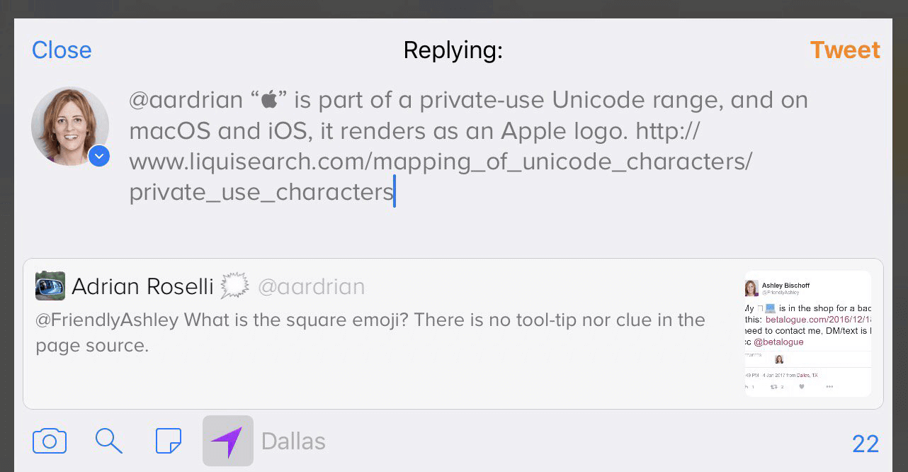
I was reminded that some operating systems allow folks to use emoji that are custom to that operating system, without telling the user that some other folks cannot see it. The tweet below shows how that is a problem. When building a web page, it is even more reason to make sure you provide alternative text.
@aardrian “” is part of a private-use Unicode range, and on macOS and iOS, it renders as an Apple logo. liquisearch.com/mapping_of… pic.twitter.com/GoQS4xEgwo
In case Twitter is hosed, just view a screen shot of the image here (115kb PNG).
Update: April 1, 2017
For reasons, I made a video showing this all in action. If the embed does not work for you then grab the video directly.
Update:March 7, 2019
sigh

12 Comments
Hi Adrian
Nice bit of code.
Does this only work if you hand code the emoji with the proper markup?
I was looking at emoji I had entered on my WordPress site and they show up in the browser inspector directly as entered. (I used CTRL-CMD-Space on Mac.)
i.e.
<p>If there are no images, Facebook can’t add one. 🙂</p>Whereas if I add a grinning face on Twitter, this is the markup generated:
<img class="Emoji Emoji--forText" src="https://abs.twimg.com/emoji/v2/72x72/1f600.png" draggable="false" alt="😀" title="Grinning face" aria-label="Emoji: Grinning face">In both cases, VoiceOver does seem to read out the emoji.
WordPress: slightly smiling face
Twitter: Emoji, Grinning face, imageWhich do you think is the better implementation for a screen reader user?
In response to . Short answer, yes, you have to do this yourself in your HTML.
WordPress just presents the character and the screen reader is free to read through it as it sees fit. However, there are two risks with just a straight character entity as Léonie mentions in her post (that prompted this post):
So it is not guaranteed to work for all browser / screen reader combinations.
Twitter bypasses that completely, and retains the ability to substitute its own branded emoji, by replacing the emoji character with an image. It then uses the
title,alt, andaria-labelto make it accessible to screen readers.I forego
title(as I do not care for using the attribute) in my example and lean on CSS generated content and a bit of other styling to mimic the effect.As for which is the better approach, I leave that up to you to understand your audience, its skill level, its screen reader and browser combination, and the context for use of the emoji. It may be worth doing a little user testing if you have any user groups to borrow.
One additional note: the approach I outline gives you as the author the opportunity to add your own meaning, to give it more context or potentially confuse it even more. As I did with the bacon in my example.
Great idea here. Sadly, we still can’t get every browser/SR combo since it relies on CSS generated content. See https://www.powermapper.com/tests/screen-readers/content/css-generated-content/ for the most recent compatibility list I’ve found.
In response to . Paul, It relies on
aria-labelfor screen readers, not CSS generated content. Using the same resource (PowerMapper is great, BTW), the reliability trend for this approach puts it at 100% as of 2015.So arguably we cannot get every browser/SR combo since they do not all support ARIA if we go back enough versions.
Are you suggesting that there is a better approach? If so, I am all ears.
Adrian, Brilliant! I totally missed the aria-label.
That is a truly gorgeous tooltip.
So on my site (aside: yes i know it has accessibility issues),
I’ve decided I’m going to just visually display text after the emojis describing what they are. Do aria-label also override :before/:after, or do screen readers always read that? And, if they do, should I just leave out the aria-label on the emojis?Thanks in advance
In response to . If you use
aria-labelit will override all the content, even content you set via::before/::afterwithin that container. For what you are describing you could just use a structure like<span data-text="banana">🍌</span>and your CSS would be[data-text]::after { content: " (" attr(data-text) ")"; }.No ARIA, no tool-tip, and the emoji and the
::afterwill both be announced by a screen reader, but it is an option that may be great for some contexts.
In response to . Hmm, that’s odd; just got a chance to try both methods (
[aria-label]::aftervs[data-emoji]::after) and NVDA read the latter as expected, but the aria-label variant was read as “emoji description graphic emoji description”.Is this a bug that I should file?
In response to . I cannot begin to debug something I cannot see. I took what I think you coded and replicated it in a codepen and both read as
Go banana (banana)in Firefox 67 / NVDA 2018.3.2.
I’m wondering about the
tabindexpart. Emojis are not links nor interactive elements (in your case, they show a tooltip upon focus, not via interaction). It seems odd for me to make it focusable. Don’t you think it can pollute the experience of navigating between interactive elements such as buttons, forms, links?Emoji case seems similar to abbreviations – if there’s no visual clue what it means, someone possibly could hover it to check it’s meaning (or click if on touch enabled device). But would you make every abbreviation focusable? It doesn’t seem to make sense as it does not do anything, rather than explaining some term/emoji, but taken out of context (because if you tab, you’ll jump between paragraphs and you won’t know what did it relate to in particular)
Thanks for article and cool blog btw!
In response to . To answer your first question, yes. Making them tab stops absolutely pollutes the page for keyboard users. But not making them tab stops keeps keyboard users from getting access to the text you add for the emoji. My overall suggestion is just don’t use emoji so you don’t need to make that decision.
Similarly, using a
titleattribute on<abbr>or<acronym>also excludes keyboard users. Generally I recommend against that pattern too.So:
- Expand all abbreviations / acronyms as you would in printed text, eg: World Wide Web Consortium (W3C);
- Don’t use emoji in narrative text, but if you do then above is a technique to make them accessible.
In response to . Thank you for your response. Agree – expanding abbreviations is best in my opinion as well.
Emoji case is interesting though. I will think about it for a little longer while.
I don’t want to drop them, but I do not intend on using them as something that is required to understand the text fully, but something rather complementary.Quick thought I have right now is providing some kind of a legend for emojis used in article and their meaning and maybe adding tooltips that appear on emojis, but with tabindex=-1 so it’s not polluting the navigation with a tab, but still can be focused by a click/tap.
It’s again simply down to finding out the Golden mean
Leave a Comment or Response