Print Styles Forgotten by Responsive Web Developers (at evolt.org)
As web browsing technology continues to change at a rapid pace, budgets to update web sites for these changes often don't match that same pace. Responsive web design has become the de facto answer to preemptively adapt sites to this constant shift, typically relying on CSS3 media queries to do the bulk of the work. CSS3 media queries allow web browsers to choose stylesheets, and as a result, layouts, that fit the display resolution of the current device.
Web developers and designers brag about their ability to craft designs that work across platforms, some even integrating transitions that only they can see when they change their window sizes. Sites have sprung up to catalog these achievements and article after article expounds the benefits and wrong-mindedness of any other approach. I tend to agree.
I am surprised, however, at the utter disregard for a media format that has existed before the web — the printed page.
This isn't a new concept. Eric Meyer presented an article at A List Apart almost 10 years ago (CSS Design: Going to Print). I have been pushing this on other web developers for years, starting in my days on the evolt.org listserv (sadly, no link to the archives showing I've been on this for 10 years, too). When we build projects for clients, we always include print styles. I consider not providing a print-friendly style to be a failure. And yet I regularly come across sites that have content I need to print that just don't seem to get it.
All the time web designers and developers put into multiple stylesheets to account for increasingly granular screen resolutions could be better used with a simple, singular print style. It doesn't need to be fancy: just keep the logo, include a breadcrumb, kill the blogroll links, remove the giant footer, let it fit the width of my page, dump the giant images that push content onto subsequent pages, and so on.
Top 10 Popular Sites on MediaQueri.es
The site Media Queries collects submissions from web developers and presents users with samples of sites that use CSS media queries, showing four thumbnails of each site at different screen widths. There is some impressive stuff there, but there is no indication of how they choose to include sites (full disclosure: I've submitted two of mine and never heard if they were accepted and so far have not found them on the site). Because the site allows users to rank submissions, I decided to grab the top ten most popular samples and see how they each look when printed. Where I could, I loaded a page other than the home page and printed it (after all, if the home page doesn't have much content, users may not want to print it anyway). Just because a site was voted to the top, that doesn't mean the developer feels it's complete, and it may be going through changes at the time of this writing.
Simon Collison
Printing the home page seemed unfair since I doubt many users would see enough content to warrant a hardcopy. Instead I went right for the Journal page for my sample. The printed page is essentially devoid of styles. As such, it's easy to read and prints well enough, but misses clear style opportunities.
Design made in Germany Issue 5
I intended to print the home page, but thanks to its infinite scroll I was getting a PDF of 137 pages. So I opted for one article via the link instead of scrolling, The Grid System. The printed layout is a simple single column, but the page itself has absolutely no branding on it at all.
Stephen Caver
A very simple site that acts as a jumping-off point to his other content on the web, I opted to print the home page because it had some meat without being a giant blog roll.
Sparkbox
The home page brags about building sites that don't sit on a desk anymore, but that copy and the logo get lost when their white copy hits the white printed page. Points for including the link of each URL on the page as text after the hyperlink, but that just means somebody thought enough about the printed page to do that, but not enough to make the brand or layout adapt to the printed page.
Food Sense

I was drawn to the video about garlic, but that would be a silly page to print, so I grabbed The Sisters Who Inspire Everyone to Cook Vegan. As with Sparkbox, the links in the copy have the URL added as text after the text link, though it does seems a bit clunky. Though the brand is missing, at least the site name makes it to the top of the page.
Andersson-Wise Architects
While a potential client may want to print some of the photos of the architecture firm's work, I opted for the less image-heavy and more print-friendly Principals page. The brand is missing, the text of the URLs of the links (see the two above) overlap some of the content, and the "Read More" links don't help me very much.
The Boston Globe
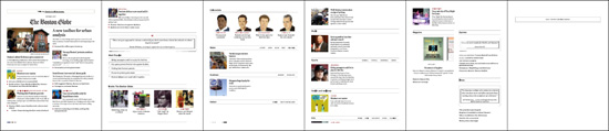
Without registering, I can only access the home page. As people swoon over this new layout it has gotten quite a lot of attention for media queries done right. In print, the brand is retained (and takes up quite a lot of space) and much of the layout adapts well, until you get down to the sections where the list of links are pushed off the page.
Think Vitamin
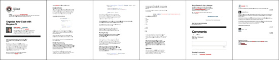
Another site with very brief or very long pages, I grabbed the article Organize Your Code with RequireJS. The logo overlapping the membership link at the top is minor, though the first half of the first page is taken up with the brand and the title. The article content itself never expands to fit the width of the page, contributing to the additional sheets of paper I'd use.
Hicksdesign
If I was making the case to hire Hicksdesign, I'd probably look at the Contact page and bring a copy to my boss. Given its lightweight collection of content, 3 pages with minimal branding and an overly-large photo are not quite what I'd expect.
Sasquatch! Music Festival
I repeatedly tried to load the site, but I received only error messages from Python and Django. The error page did print pretty well, however, just in case I wanted to present it to my IT guy so he could see the messages.
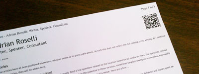
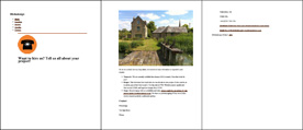
My Own Site
My site has been through a couple redesigns since I launched it, and I do know people have printed articles from my site (some have said as much at my speaking gigs). I have no illusions that my site will win any design awards, but I do think that my support for the printed page is far beyond others I am seeing, just from the examples above. Some of the techniques I use:
- I no longer write the full URL of the hyperlinks immediately after the text link. Feedback from users was that were too long and nobody was going to manually type the address in when they could just go to my site and follow the link.
- I make sure my branding is in place. Without a logo, my branding is quite simple but no easier or harder to incorporate.
- I include the breadcrumb trail on the page. Users may not get the full address of the page on the printed page, or they may not want to type it into the browser, but knowing the path to get to the page allows them to find it easily.
- I incorporate a QR code into the printed page. On some level, this is just a whiz-bang feature, but it is also a quick and easy way to visit the page right from a mobile device, and since the site uses media queries to adapt to mobile devices, the page will look good (or at least be functional).
- I try to eliminate large swaths of color. Color printer ink can be expensive, so I reduce the page template itself to as much black and white as possible. I even clear the colors our of hyperlinks to match the color of the copy.
- I adjust the copy for the printed page. I revisit my type sizes, my leading, my margins, and even the relative spacing between headings and paragraphs. I try to make the printed page as legible as possible.
- I remove navigation, both primary and secondary, but keep the footer links and copyright. On the printed page, people aren't going to click or tap to elsewhere on your site, so it's best to reclaim the space.
Conclusion
I know my techniques don't apply to all sites, but I think they are at least a good starting point and warrant a discussion. Spending the time to make your site adapt to different screen resolutions is only part of the process. The assumption that users don't print web pages is one made from a narrow perspective, with the belief (and ego) that everyone uses the web like you do.
Leave a Comment or Response