IE10, Metro, and Media Queries


I worked pretty hard on our corporate site to test on as many devices and browsers as possible, trying to ensure that my media queries were solid and I was staying cutting edge without being bleeding edge. You might recall that I am already not a fan of testing in Internet Explorer emulation modes, but now I think I need to get the hardware to go along with my IE testing.
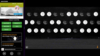
I recently picked up a Windows 8 tablet, making sure it had both the desktop and the (formerly-named) Metro interface. I set about testing the Algonquin Studios site in Internet Explorer 10 in both modes and was surprised to see that in the tablet / Metro mode my media queries were being mostly ignored (the site is built mobile first, so it honored the desktop queries). I took some screen captures and reached out to the Twitters for help.
Roger Johansson was kind enough to help:
@aardrian You may need @-ms-viewport {width:device-width;zoom:1.0; }
— Roger Johansson (@rogerjohansson) May 22, 2013
This sounded familiar but I did some digging (now that I had some direction) and came across this note in a six-month-old MSDN article:
By default, Internet Explorer automatically scales content when the window is narrower than 1024px. This primarily includes the snapped state and portrait mode. If the
@-ms-viewportrule is specified, it overrides default scaling.In cases where scaling is not needed or desired, the
device-widthkeyword can be used. This keyword signifies that the page is optimized to work well regardless of the dimensions of the window.When using this keyword, make sure that the page continues to work well in a variety of window sizes, including the narrow snapped state and portrait modes.
My tablet’s width is 768 pixels, so it definitely fell under the 1,024 pixels that trigger scaling. This note, however, doesn’t provide any context for how this only affects IE10 in Metro mode, because the media queries clearly work fine when using IE10 in the desktop mode.
I excluded the zoom:1.0; from Roger’s tweet, popped open my CSS file, and added @-ms-viewport { width: device-width; } right to the top of the file, outside of any media queries. I deployed it and all was well (I actually went through a full testing pass, test deploy, and the likes, but that part of the story isn’t very interesting).
Perhaps everyone else already knows this and I am incredibly late to the game, but just in case there’s someone who is stuck or doesn’t have access to the right IE10 configuration, I hope this helps.
The lesson I learned here is that if I want to properly test Internet Explorer 10, I can’t rely on a desktop installation on Windows 7 or Windows 8, I need to also test in the Metro interface and, ideally, on the appropriate hardware as well. Looking at my logs, I see more than a few users who have come to the site with an IE10/Win8 configuration who may very well have thought the site was not responsive.
For those interested, this screen capture shows my home page after deploying the CSS update:

Update: May 24, 2013
Thanks to Matt Stow‘s comment below (which demonstrated my clear lack of Google-fu), I now know of some resources online that have been down this path and also addressed the best approach to supporting Windows 8 Snap Mode (example of Snap Mode below if you are unfamiliar with this). It turns out that Windows Phone 8 has a bug which makes my solution inadequate, although there is a scripting fix in Matt Stow’s article which you can layer on top of this. On to the links:
- IE10 Snap Mode and Responsive Design, OCtober 17, 2012 by Tim Kadlec.
- Windows Phone 8 and Device-Width, January 14, 2013 by Tim Kadlec.
- Responsive Design in IE10 on Windows Phone 8, January 6 2013 by Matt Stow.

Update: October 15, 2013
Matt Stow reports that Microsoft has fixed the Windows Phone 8 viewport issue.
Update: July 31, 2014
In today’s Twitter chat with IEDevChat, people are still asking why @-ms-viewport is needed.
#AskIE @alanpeto It's hard to describe all the reasons in 140 chars. Sites need to use @-ms-viewport for modern UI http://t.co/7Gx8pqSKu9
— IE Dev Chat (@IEDevChat) July 31, 2014
As for reported issues with width: device-width, looks like we’ll have to wait until Monday to know any more:
#AskIE @James_M_South Adjustments were made across the board to improve the end-user experience. Specifics will be published on MSDN Monday.
— IE Dev Chat (@IEDevChat) July 31, 20143 Comments
Not sure if you're aware, but device-width doesn't work on Windows Phone 8. I did lots of research and have a solution here: http://mattstow.com/responsive-design-in-ie10-on-windows-phone-8.html
In response to . Matt, I wasn't aware. Without a WP8 device here I can't truly test every device, which is part of the gist of my post. Thanks for the link. I have updated this post accordingly.
This Article was mentioned on adrianroselli.com
Leave a Comment or Response