Target Size and 2.5.5
TL;DR: Regardless of what accessibility conformance level you target, try to ensure that interactive controls are at least 44 by 44 pixels in size. Links in blocks of text are exempt.
Overview
In real life there is typically both a visual and tactile component to an interface. You have to be able to feel the button splits or ridges of your car’s climate control if you don’t want to take your eyes off the road. Touch typing relies on sensing the F and J nubs (for U.S. English keyboards, at least) and the gaps between keys. Fumbling with a light switch in the dark is about sliding your hand around the wall.
With computers running a graphical user interface (GUI), clicking a button or link is a matter of getting either a proxy for your finger or your finger itself into the right spot and not missing. You can swing a mouse pointer around a screen without clicking and nothing bad happens, but you cannot drag your finger across your phone to feel the number pad. A stylus could do either, depending on the developer’s intent.
Real life factors such as bumpy roads (as a passenger in a car, not a driver), hands sticky with ice cream, single-handed use of giant displays, old ball mice full of desktop lint, or mobility impairments can make a graphical interface confounding to use. Luckily some people have been considering these challenges for quite some time.
Fitts’ Law
The GUIs we use today are informed both by experience going back millennia and research that is a bit more recent. For example, in 1954 Fitts’ Law put to words something we may have have innately understood — the time to get to a target is related to its distance from our starting point and its size. The outcome of testing this with users is that small targets result in greater error rates.
I am oversimplifying a bit, but the gist is that the world of interaction design has known about the need for larger targets for longer than there has been a field of interaction design, let alone GUIs. However, there is plenty of evidence that individual interaction designers maybe do not know this.
That is part of how we got to a state where we need to mandate larger target areas within WCAG.
WCAG
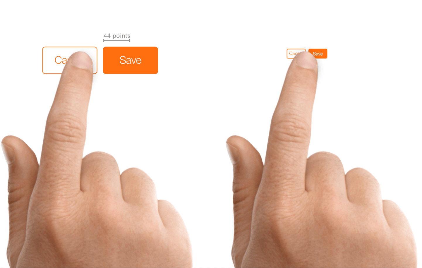
WCAG 2.1 brought with it a few new success criteria. 2.5.5 Target Size requires a target area for a pointer interaction (touch or mouse, for example) to be 44 × 44 CSS pixels. This equates to a visual angle of about 0.9372 degrees, or whatever you get when you make a 44 pixel block and view it in your browser with default zoom.
There are exceptions:
- If there is a duplicate or equivalent version of the control at the minimum size, then an instance can be smaller;
- If the control lives within the flow of a chunk of text;
- If it is a default control from the browser with no styles applied;
- If its smaller size is essential to accurately conveying information.
2.5.5 is a level AAA success criterion, which means organizations targeting AA compliance (essentially all of them) are likely to ignore it. Which is unfortunate, given the potential benefit. Reasons for why this was classified at AAA are beyond the scope of this post. Luckily, there are platform guidelines and interface design names that advocate for a larger target size, independent of WCAG.
Apple
Apple provides design tips for touch target sizes across its devices. For iOS, it recommends 44 points × 44 points (not pixels) as a minimum.
For buttons on watchOS, Apple recommends different minimums based on the shape of the button using the following (confusing to me) table.
| Button type | 38mm (minimum) | 42mm (minimum) |
|---|---|---|
| Circular | 75 pixels | 80 pixels |
| Round rectangular | 50 pixels high | 52 pixels high |
There appear to be no minimum control sizes for macOS, nor for its Touch Bar, though the Touch Bar maximum height is 60 pixels, with 44 pixels recommended as the maximum height for icons.
Microsoft
Microsoft provides guidelines for touch targets in Fluent, its design system, as 7.5mm square, or 40 × 40 effective pixels (epx) on a 135 PPI display, at default zoom. This was a decrease from 44 pixels (epx), which was the Universal Windows Platform standard prior to the Windows 10 October 2018 Update (version 1809).
The page also outlines what to consider as you size touch controls:
- Frequency of Touches — consider making targets that are repeatedly or frequently pressed larger than the minimum size.
- Error Consequence — targets that have severe consequences if touched in error should have greater padding and be placed further from the edge of the content area. This is especially true for targets that are touched frequently.
- Position in the content area.
- Form factor and screen size.
- Finger posture.
- Touch visualizations.
These sizing standards are not brand new in Fluent. If you go back to 2017, you can see Microsoft recommended a minimum target size of 60 pixels, or 11mm square, which included 2mm of padding to the next target. Note that here it referred to targets, not touch targets.
Android
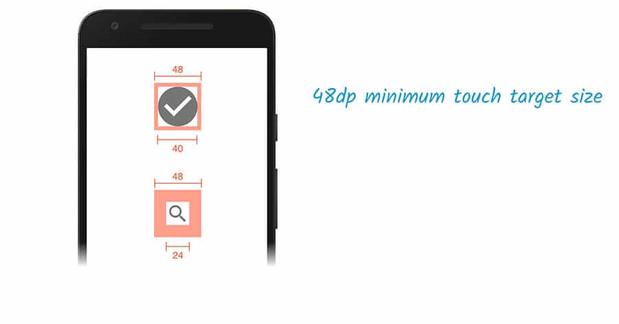
The Android Developer Guide recommends a minimum touch target of 48 × 48 device pixels. Unfortunately, this information is buried in the Accessibility section of the Best Practices portion of the guide instead of alongside or embedded within the documentation for building touch controls.
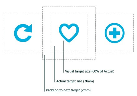
Google reinforces this sizing in the Web Fundamentals course in the section for accessible styles. In addition to noting that 48 device pixels is 9mm (which it asserts is the size of a person’s finger pad area), it also suggests an 8 pixel gap between controls to minimize mis-taps.
BBC
BBC’s Mobile Accessibility Guidelines are a set of standards for BBC employees and its suppliers when developing web or native content or apps. They defer to the Android and iOS platform guidelines for native apps and recommend a minimum 7mm touch target.
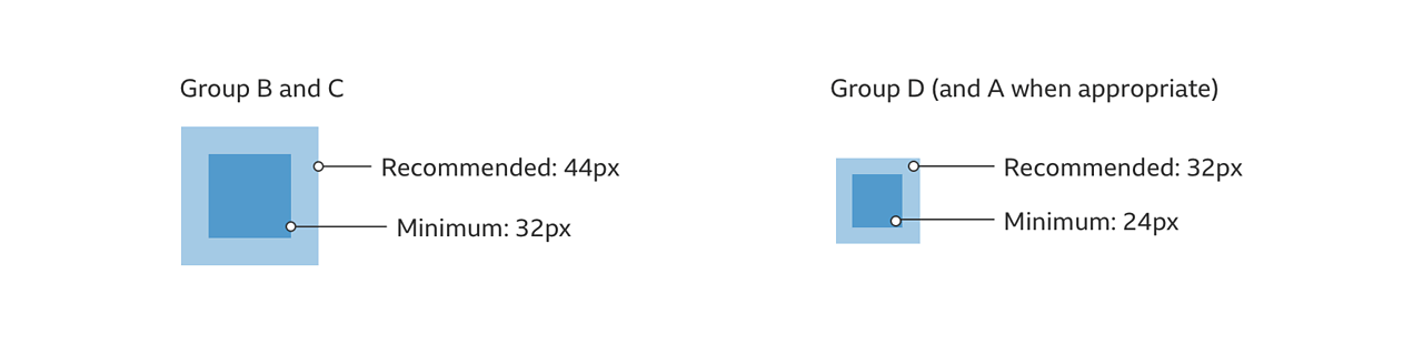
Global Experience Language (GEL) is BBC’s design system for all of its online presence. GEL recommends a minimum touch size of 7mm, with 5mm in special cases. For cases where either dimension cannot be 7mm, then it mandates a 5mm exclusion zone. It also provides these dimensions in pixels — recommended 44 pixels with a 32 pixel minimum, and for special cases a 24 pixel minimum.
Nielsen Norman Group
Nielsen Norman Group recommends a touch target size of 1cm (0.4 inches). NNGs touch target article cites studies of finger sizes, references Fitts’ Law, and shares a few examples. It is a good resource if you need to convince others on your team of the importance of reasonable sizes but who may not be interested in the platform guidelines nor the WCAG SC.
The article declines to offer pixel sizes. This is recognition of the variation of displayed physical pixel dimensions across devices. That brings us back to the impracticality of holding a ruler to a screen, let alone holding a rule to each of a sampling of screens that correspond to your audience.
Testing Reference
44 pixels will have different physical sizes across devices, even with no zooming applied. For example, 44 pixels on an iPad will be physically larger than 44 pixels on an iPad Mini, owing to them having the same pixel count but in hardware with different screen sizes.
You cannot be expected to grab a ruler and measure every device. You can, however, create a reference box at that size and view it across devices, comparing it to the controls you have in your design and ensuring they are at least that large. I made a 44px reference square and embedded it below.
See the Pen 44px Square for testing 2.5.5 Target Size by Adrian Roselli (@aardrian) on CodePen.
Example
Above I mentioned that devices with the same pixel count will show pixels at different sizes depending on density / hardware size.
As an example, the iPad and iPad Mini both have 2,048 × 1,536 pixel displays. But the iPad Mini has a 7.9-inch display (for 326 pixels per inch) while the iPad has a 9.7-inch display (for 264 pixels per inch).
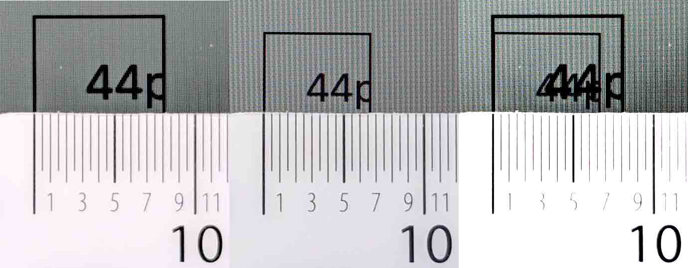
A 44 pixel square on an iPad has a 68 square millimeter touch area. On an iPad Mini that same 44 pixel square is just over 45 square millimeters, or only two-thirds the size of the iPad.
Strictly speaking, if you choose to follow BBC GEL guidelines of a 7mm touch target, confirm it on an iPad, and get boss / client approval, then every time a user opens your project on an iPad Mini they would get something that was not approved. Sure, that is hair-splitting pedantry, but I assure you those complaints happen (from conference attendees and Twitter accessibility warriors).
Wrapping it Up
For controls that can be activated by touch, with a pointer a stylus, or some other physical device, make sure they are large enough to hit easily and have enough dead space between them to help avoid mis-clicks or mis-taps.
Even if WCAG AAA compliance is not your goal, lean on the guidelines from places who have been doing this a while and confirm those sizes work for your users in their contexts (such as a pitching fishing trawler versus a living room Davenport).
44 pixels is probably a good minimum, given that it or a value near it is consistently recommended across experts, standards, and platforms.
Completely Unrelated
The opening image is from I Touch Myself by Divinyls, fronted by Chrissy Amphlett. In 2013 she died of breast cancer and complications from multiple sclerosis and this song soon became the anthem for the Australian breast cancer awareness project “I Touch Myself.” The U.S. Centers for Disease Control has information on breast cancer awareness.
Update: 10 June 2019
Shortly after posting, I was asked about the challenge making footer links conform to WCAG 2.5.5. Patrick Lauke walks through a bit of the history of the SC and his ultimate recommendation.
The general argument I am making is less about WCAG conformance and more about making a usable interface while leaning on the lessons of past research and guidelines. But mostly, in cases like this, make sure a user cannot easily mis-tap the wrong thing but can still get to the thing you want.
Update: 2 October 2019
A couple resources to help you try to maximize your hit areas:
- Enhancing The Clickable Area Size by Ahmad Shadeed;
- Create a semantic “breakout” button to make an entire element clickable by Andy Bell.
When implementing ideas from Ahmad’s article, be sure to leave dead space between clickable / tappable areas. You would to minimize the chance of an errant selection if you can. Sufficiently large areas should help minimize that risk, of course.
Andy’s article builds on the idea of block links like I have on the index pages of this site. It breaks the ability to select text. Further, users may not expect an area outside of a button to still be the button, so please test this with your users first.
Update: 25 August 2020
Jared Smith has made a bookmarklet to make it easier to test if a thing on the page is 44 × 44 pixels. This is ace.
See the Pen 44×44 Pixel Cursor Bookmarklet by Jared Smith (@jared_w_smith) on CodePen.
Update: 26 August 2020
I heard someone complain they could not reset the cursor, so I forked Jared’s post and added that feature. You can press Esc and CSS gets added to set the cursor to revert. Obviously there is some risk to using Esc, but I figure for testing it is fine, until it is not, and then you can customize it to a key or combination that works for you.
A better solution is to destroy the CSS block entirely, but I have to go make dinner.
See the Pen 44×44 Pixel Cursor Bookmarklet by Adrian Roselli (@aardrian) on CodePen.
Update: 12 June 2021
Exactly 2 years after this post went live, CSS-Tricks published Looking at WCAG 2.5.5 for Better Target Sizes. It has some nice screen shots and discusses the pointer feature query, but I fear it does not stress the Level AAA nature of this SC enough.
I left a comment linking to the NNG, BBC, and Fluent materials above, along with the bookmarklet. Patrick Lauke left a comment stressing which pointer query to use so you do not accidentally exclude multi-input devices.
Update: 15 July 2021
This post got a nice shout-out in the 2 July 2021 UX Podcast episode #266 Target size:
James Royal-Lawson: Target size is not something new. It’s been in the WCAG guidelines for a while. But beyond that, target size is something that’s been included in other design systems and recommendations for a fair while. And there is an excellent article by Adrian Roselli about target size. And in his article, he actually does do some of the heavy lifting and find some of the good examples and or existing examples of places and recommendations that are out there.
Update: 21 December 2022
Tetralogical has a new post in its foundations series, this one about target sizes: Foundations: target sizes. It offers some quick tips:
- Make sure that controls are appropriately sized and spaced
- Test the size of controls with your audience, including people with disabilities
- Implement spacing and target sizes consistently
For the most part it hits the same points I do, which continue to confirm that sizing is critical for many users.
9 Comments
Thanks for the article – nice summary. What is the purpose of the SR-only ‘anchor’ word in every heading? for example: Nielsen Norman Group#anchor
In response to . I put the link on headings that have
idattributes so that a reader can grab a link to a specific section more easily. I noticed folks were sharing posts with instructions on which header to scroll to, so my hope is this would make it easier.
In response to . Right. Well, good intentions, but suboptimal implementation … given it’s a post about accessibility and usability, thought you might like to know that this feature is neither?
In response to . Thanks. Can you share one that is optimal? Or one that is your favorite?
In response to . Hello, I tried using chromevox and voice over in mac, here’s what I found:
- in chromevox it is announced as: anchor, internal link
- in voice over it is announced as: link, anchor
I am not sure, but perhaps a better implementation would be, making the header a link itself?
<a href="#NNG" rel="nofollow ugc">Nielsen Norman Group</a>Thoughts?
In response to . I used the word anchor as the link text because I wanted it to be brief for screen reader users. Not all SRs indicate the link is an anchor, while the preceding heading text gives it context (also satisfying 2.4.4). This way an SR user who recognizes the pattern can stop the announcing of the anchor link when reading or navigating within the page, all while still getting the heading text.
As such I prefer not the make the link text longer or inconsistent, but I am open to suggestions.
And yep, I tested with some SR users.
The incoming hyperlink only requires a fragment identifier the destination for which is an ID attribute on a heading or anchor – it doesn’t require an anchor with a href attribute and offscreen text etc. For example: https://adrianroselli.com/2019/06/target-size-and-2-5-5.html#Overview will load the page scrolled to the overview heading.
There is a flaw in Jared’s bookmarklet. The drawn box is much bigger when used relative to objects on the page, objects that are bigger than 44px as computed/rendered, but when I take a screenshot that includes the cursor image, it is much smaller relative to those same page objects than what is observed with the eyes. Something is wrong with it. Can it be fixed?
In response to . Are you on a Mac?
If so, have you increased the default macOS cursor size? Check System Preferences… → Accessibility… → Display… → Cursor . If it is set to anything other than “Normal” then the cursor will be the wrong size.
A bit of the debugging process in a Twitter thread.
Leave a Comment or Response