New Tool for Determining Browser Viewport Size
Nine years ago I had become fed up with trying to explain to clients, users, friends, co-workers, and strangers that screen resolution, browser chrome, and browser size combine to create some unique viewport sizes. What this meant was that whether a user had a display at 640×480 or at 1,024×768 was irrelevant if both users had their windows set to the same size. Factor in toolbars, scrollbars, add-ons, and other configuration settings and you had a wide range of viewable space for your web site design that was only loosely related to the actual screen resolution of your end user. I distilled all this down in an article, Real-World Browser Size Stats, Part II (part I described the code I used), written back in 2000 that provided statistics on the viewable area in a browser per screen resolution setting.
Since then many others have started reporting on screen resolutions but few have taken it a step further to report on actual viewable area within the browser. Too many of them, like this chart on the W3Schools site, list the screen resolution trends but neglect to mention that once you pass 1,024×768, users are less likely to surf full screen. Human Factors International even cited my article, but got the conclusion wrong (claiming that as users got more screen real estate they opened more pages).
Today Google has gotten a little closer to getting the point. In a blog post introducing this new tool Google mentions that users were looking at Google Earth, but just not downloading it. After some testing they found the that download button was displaying off screen to the right (outside the viewport) for some users. So they built a tool to help show the breakdown of viewport sizes of users visiting the site as a contour visualization. After seeing some value in this tool for web developers in general, they modified it a bit to make it possible for a user to interact with the page under the contour map. As the mouse moves across a page, a small block of blank space is left around the cursor so that the user can click links or fire hover actions.
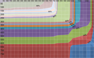
Contour map of viewport size statistics.
Head on over to browsersize.googlelabs.com to try out the tool for yourself. When you get there you will see a sample site is already loaded up. The percentiles used in the overlay are pulled from the latest data of visitors to Google.com, so don’t think that they numbers necessarily apply to you (my own experience is that for targeted sites they may not). Type the address of your web site (or any site you want to test) into the search box and submit. Give it a little time to load and you are ready to start looking. You can now see what parts of your site are visible (or cut off) at what viewport sizes.
Beware, however, that this tool isn’t foolproof. For liquid sites or for sites that float in the middle of the page you may find the numbers don’t mesh up as you’d expect. In those cases you can scale your browser window down (width and/or height) to at least get an idea of how it might appear at a specific window size. The numbers on the contour map also don’t correspond to known screen resolutions, so you’ll need to compare them to other numbers just to be certain you have your data points right. The tool also doesn’t account for scrolling, which we all know users do. Instead it shows you how a page might look simply at first load. Because this is a freebie from Google Labs, consider the documentation sparse (which isn’t a criticism).

Amazon.com as viewed using the Google Browser Size tool.
Leave a Comment or Response