Keep the Focus Outline
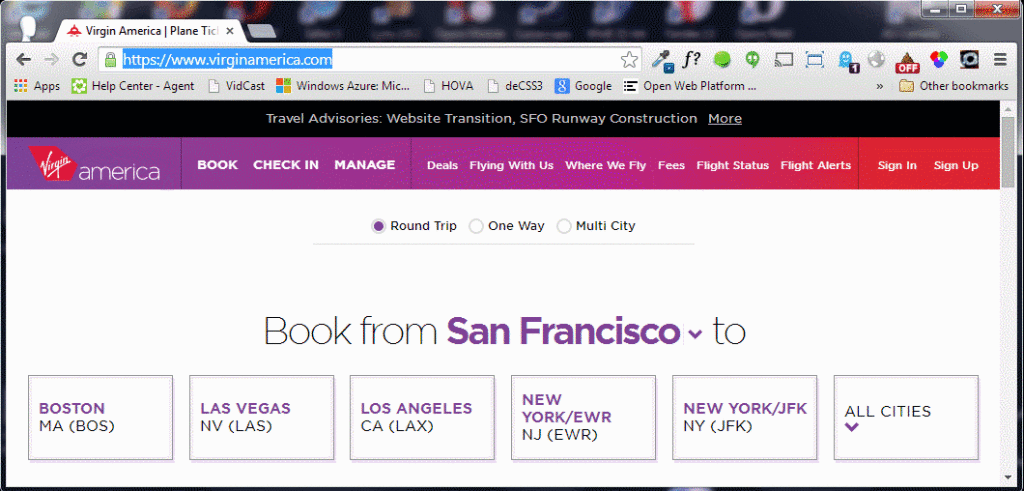
Today’s rant is inspired by all the gushing over Virgin America’s new web site — just because it’s responsive.
To be fair to Virgin America, making its site responsive is a huge win for users whose primary method of booking is via a smartphone or tablet (or, god forbid, phablet or tablone). Its new site, however, is a huge step backward for users who rely on the keyboard as their primary method of interaction.
Virgin America’s CSS has a style to identify anchors with focus (yes, there are other elements that should get focus, but I am looking at just the most basic support): a:focus {outline: thin dotted;}
What’s so frustrating is that the useful style is then overridden with this harmful declaration: a:focus {outline: none;} This override greatly decreases the usability and accessibility of the site. Unfortunately, this practice is still common on many more sites across the web.
As a web developer, one of the simplest accessibility tests you can do is unplug your mouse. Two quick things to review as part of that: Can you interact with all controls with only the keyboard? Can you tell which item has focus?
Even if you aren’t motivated to run that simple test from an overriding sense of being nice to your users, there’s a legal concern here. As I wrote last week, the U.S. Department of Justice held H&R block accountable to Web Content Accessibility Guidelines 2.0 Level A and AA Success Criteria. That means there is case law for making your consumer-facing site comply or face penalties.
By excluding focus styles, Virgin America is running afoul of one of the AA Requirement 2.4.7:
2.4.7 Focus Visible: Any keyboard operable user interface has a mode of operation where the keyboard focus indicator is visible. (Level AA)
In short, if your site doesn’t make interaction elements obvious when accessed via keyboard, not only are you hurting users, you’re opening yourself up to litigation.
Further Reading
Again, this isn’t a new issue. It even has its own mini-site at OutlineNone.com, which offers these handy links:
- http://www.456bereastreet.com/archive/200905/do_not_remove_the_outline_from_links_and_form_controls/
- http://webaim.org/blog/plague-of-outline-0/
- Web Content Accessibility Guidelines (WCAG) 2.0 (2.4.7)
- Failure of Success Criterion 2.4.7 due to styling element outlines and borders in a way that removes or renders non-visible the visual focus indicator
To add another, this article, When Do Elements Take the Focus?, might be handy to understand just when you can expect to see :focus styles get applied by a browser.
Related
In March I wrote about how Google removed underlines from search result links. My concern there was that web developers might follow suit. Between removing keyboard focus indicators and underlines from links, I am amazed that developers do so much to make the core interaction element of the web essentially hidden to so many users. I am reproducing the list of related links here as they are relevant to the overall issue of keeping links usable:
- NoCoffee – Vision Simulator for Chrome (added March 25, 2014).
- WebAIM Color Contrast Checker.
- Juicy Studio Luminosity Colour Contrast Ratio Analyser.
- Contrast Ratio by Lea Verou.
- Color Contrast Analyzer Chrome plug-in.
- Use Adobe Photoshop proofing features to simulate color blindness.
- G183: Using a contrast ratio of 3:1 with surrounding text and providing additional visual cues on focus for links or controls where color alone is used to identify them
- Links with a 3:1 contrast ratio with surrounding text, which also shows 26 web safe colors to use with black or white text.
- F73: Failure of Success Criterion 1.4.1 due to creating links that are not visually evident without color vision
- Making Accessible Links: 15 Golden Rules For Developers at SitePoint (note rule 11), February 20, 2014.
- To Underline or Not Underline Links, March 9, 2012.
- Keep the Underline at WebAxe, April 14, 2013.
- Do Links Need Underlines? by Jared Spool, July 5, 2006.
My Efforts to Reach Virgin America (so far)
I may have contacted Virgin America on Twitter once. Or Twice. Or three times. Perhaps even a fourth time. And filed a bug with WebCompat.com. And left a comment at Wired’s article. I’ve embedded the tweets below so you an retweet if you are as whiny as I.
Hey @VirginAmerica, to help you fix your lack of keyboard access, I left a bug report for you at @webcompat: webcompat/web-bugs/issues/141
— Adrian Roselli (@aardrian) June 18, 2014Hey @VirginAmerica, I left a comment about your lack of keyboard access at that Wired gush-piece: http://t.co/9RAjaLcAdS
Just trying to help
— Adrian Roselli (@aardrian) June 17, 2014Seriously, @VirginAmerica, just go into main.css (https://t.co/E1Jh0qSu74) and *at least* delete this:
a:focus{outline:none}
2 minutes.
— Adrian Roselli (@aardrian) June 16, 2014Useless for keyboard users. RT @RWD: […], so I missed that the new responsive @VirginAmerica site went live! http://t.co/RM1tikjo14
— Adrian Roselli (@aardrian) June 16, 2014Update: June 27, 2014
On December 12, 2013 a rule became effective from the U.S. Department of Transportation (DOT) titled Nondiscrimination on the Basis of Disability in Air Travel: Accessibility of Web Sites and Automated Kiosks at U.S. Airports. That links points to the following section on accessibility:
Finally, we proposed a tiered implementation approach in which the WCAG 2.0 standard at Level A and AA would apply to (1) a new or completely redesigned primary Web site brought online 180 or more days after the effective date of the final rule; […]
As keyboard accessibility is one of the requirements of WCAG AA compliance, Virgin America’s new site does not honor this rule. However, if the Virgin site officially launched before June 10, 2014, then it squeaks by on a date technicality.
More information on the implications of the law are in the post New accessibility rules coming to airline websites. Are you ready?
Update: July 21
It took just over a month, but Virgin America responded to me:
@aardrian Thanks for your feedback on the #VXnewlook Please follow + DM if you'd like to share more.
— Virgin America (@VirginAmerica) July 21, 2014I don’t see any reason to follow and/or direct message to share more information. I have this blog post, which I’ve linked repeatedly. I think that’s plenty. I responded and asked if or when the issue would be fixed, but I’ve been met with silence. Perhaps in another month I’ll hear more.
In the meantime, given the amount of action the below tweet of mine has gotten, I know I am not alone in thinking that disabling the focus outline is generally a bad idea:
Use this ONE WEIRD TRICK to make your sites keyboard friendly:
Delete this:
:focus {outline: none}
— Adrian Roselli (@aardrian) July 17, 2014Update: October 15, 2014 — Screen Reader Walk-Through
Marcy Sutton, at the JSConf, provided a walk-through of the Virgin America web site experience using a screen reader. It does a great job of showing what a terrible experience this site has created. I’ve embedded it below, bracketed to the relevant part of her talk, or you can view it directly on YouTube (starting at 0:20).
Update: October 23, 2014
Here is a video of the screen reader walk-through, pulled from the latest version of Marcy Sutton’s slides on Angular Accessibility:
Update: November 8, 2015
Virgin America once again motivated me to write a new post owing to a recent change on its site: Be Wary of Add-on Accessibility
Update: November 10, 2015
Jennison Asuncion points out that airline web sites must be accessible by December 12, 2015 — or just about a month from now. SSB Bart Group outlines the core features of a site that must be accessible next month (such as booking a flight or checking in), and outlines what can wait until December of 2016 (just some leftover marketing pages at that point).
It’s possible Virgin America paid for the third-party solution in an effort to make the deadline. Sadly, if nothing improves between now and next month, Virgin America will not be compliant and may have to throw more money at an already sub-par solution.
Update: Also November 10, 2015
Today Smashing Magazine has kicked off a UX review series starting with the airline industry. Virgin America’s site ranked well, but no consideration of accessibility was mentioned anywhere. So I got ranty in the comments.
Update: April 4, 2016
Virgin America is getting bought. Hope they don’t average the accessibility efforts between Alaska Air and Virgin America.
Well this is one way to deal with Virgin America airlines's terribly inaccessible website cnbc.com/2016/04/04/alaska-air-to-buy-
Update: May 29, 2018
In its final 🖕 to keyboard users, Virgin America makes background color of page the same color as Chrome / Firefox / Safari focus ring.

To spare you eyedropping…
- Foreground:
- #4E8FFE
- Background:
- #0F64CE
- Contrast ratio:
- 1.8:1
- Text
- failed at Level AA
- Large text
- failed at Level AA
Update: June 4, 2019
Hidde de Vries has a new post at Mozilla Hacks, Indicating focus to improve accessibility, where he recommends not just keeping the focus for all interactive controls, but also going beyond the browser defaults.
Update: September 3, 2020
Chrome 86 has added a feature to give users the ability to force focus styles no matter what terrible code has made it into your site that prevents focus styles.
For these users, Chrome 86 adds a setting called Quick Focus Highlight.
Quick Focus Highlight temporarily highlights the currently focused element, and causes
:focus-visibleto always match.To enable Quick Focus Highlight:
- Go to Chrome’s settings menu (or type chrome://settings into the address bar).
- Click Advanced then Accessibility.
- Enable the toggle switch to Show a quick highlight on the focused object.
Once Quick Focus Highlight is enabled, focused elements will show a white-blue outline with a blue glow. (See the image below.). The Highlight uses these alternating colors to ensure that it has proper contrast on any background.
The post has more information about :focus-visible and a reminder that you cannot rely on it as a method to detect hardware.
One Comment
[…] accessibility nightmare. On the simplest level, it is completely unusable with a keyboard (https://adrianroselli.com/2014/06/keep-focus-outline.html). On a more complex level, it fails to work with screen readers at all […]
Leave a Comment or Response